
Holo Hele
Improving Oʻahu's Transit
App Experience
Background
I took on a redesign project to enhance Dabus's usability, addressing challenges like confusing navigation and outdated design. Through user research and iterative prototyping, I improved the flow of each feature, introduced new functionalities like get directions, notifications, and modernized the UI. Now, both locals and new residents can navigate the bus system with ease.
Project Type
Solo Student Project
Timeline
Dec. 2024 - Feb. 2025
Tools
Figma
Discovery...
The current Oahu transit app is unreliable.
After realizing I had been viewing the wrong stop for an entire year, I was curious to see if anyone else was facing the same problems as me, a student commuter.
Solution
Streamlining Navigation & Enhancing Features
A well designed transit app should allow users to be able to have everything they need at the palm of their hand. In my design, I implemented essential features and improved existing flows and UI to make the app easier to navigate and give users more confident in choosing and finding their stops.
Smarter Navigation & Search
A unified search allows users to search in their preferred method without needing to go through multiple screens.
Users can also search by destination.
No More Guessing Games
Real-time, step-by-step directions, ensures that you get to where you need to be.
Never be late
Don't want to be met with a surprise route shut-down? Holo Hele sends notification directly from Oahu transit center.
Revamped UI with local vibes
Because why not.
Initial Dive
User Research
In order to understand users' pain points and to make sure I wasn't the only one facing them, I conducted extensive user research including:
8 Interviews
with college students, working professionals and elders who consistenly rely on the bus app.
100+ App Reviews
to understand the most common pain points and what users are most frustrated about.
What did I find?
User Research
In order to understand users' pain points and to make sure I wasn't the only one facing them, I conducted extensive user research including:
8 Interviews
with college students, working professionals and elders who consistenly rely on the bus app.
100+ App Reviews
to understand the most common pain points and what users are most frustrated about.
App Review Analysis
After understanding what makes a transit app reliable, I wanted to understand what makes the current Oahu transit app unreliable and which specific lack of features contribute?
100 Reviews+
Analyzed
It was concerning to me how an app with over 100k downloads can have this many errors and lack of core features to make navigating Oahu simpler. I wanted to understand what else can be improved other than adding new features.
Challenge to Navigate the App.
Users find the app confusing with all the search options and lack of clarifications on what each does.
Lack of Essential Features.
Users expressed how frustrating it is to not be able to search by destination or plan a trip.
Hard to Oragnize.
Frequent riders have expressed how a file function would be helpful in organizing their favorite stops.
Unreliable.
Users have expressed frustration on frequent app crashes, inaccurate GPS arrival times, and lack of notice for cancellations.
User Interviews
I was able to interview with some of my peers who use the app frequently.
6 Students
Interviewed
Highlights
80% Found the GPS to be inaccurate.
Most have expressed at some point to have missed a bus or been late to class due to the arrival time being inaccurate.
100% have had to use Google Maps at some point
Most have expressed that the lack of trip planning renders the app useless if they do not know which bus to take at the start.
Some have expressed they do not understand certain search functions.
100% expressed that the UI is outdated and may have contributed to GPS inaccuracy.
Some users pointed out that the app sometimes does not refresh which led to wrong arrival time, contributing to the notion that the GPS is inaccurate.
Some were unfamiliar with fare capping features offered
Competitor Analysis
Although Dabus2 does not have any direct competition, I wanted to understand how different transit apps typically function like to gather ideas.

Multiple features
Behind a paywall

Multiple features
Tons of ads

Multiple features
In-app fare payment
Is only for Austin, Texas

Multiple features
Not transit-focused
02 Empathize
Who are we designing for?
Leilani
Nurse

The Local
I need this app to tell me something I don't already know, like if my usual bus is delayed.
Traits:
Highly familiar with the public transport system
Knows alternative routes
May not rely heavily on the app for basic information but uses it for real-time updates
Needs and Goals:
Accurate and timely information
Quick and easy route changes for daily errands or commutes
Advanced features like service disruption alerts and ticket syncing
Mari
Student

The NewComer
I need this to be simple and informative so I can get the hang of getting around quickly.
Traits:
Limited but growing familiarity with the public transport system
May be a student or new resident
Concerned about both short-term and long-term commuting options
Needs and Goals:
Wants to understand the best commuting routes and alternatives
Interested in features like fare capping and monthly passes
Seeks a quick and easy transition into becoming a regular user
Rachel
Lawyer

The tourist
I don't want to get lost; I want to see as much as I can while I'm here.
Traits:
Unfamiliar with the public transport system
Interested in seeing multiple points of interest efficiently
May have additional concerns like language or currency
Needs and Goals:
Intuitive and user-friendly interface
Multi-language support
Simplified fare structure or suggestions for tourist passes
How might we make the app reliable for users with varying knowledge of Oahu?
03 Ideate
Setting up the groundwork for my prototype
Prioritization Matrix
Initially, I had trouble determining the scope of the project. In order to avoid adding too many unnecessary features or creating a budget google maps, I prioritized features that would actually address user issues.
High Impact
Low Impact
Low Effort
High Effort
Search by Destination
Trip Planning
Live Direction
Multi Language Support
On Boarding
Notification
Fare Payment
Dark Mode
Rate Rides
Multi-Modal (Skyline, Uber, etc.)
Files Function for Favorites
Heuristic Evaluation
One of the biggest issues with the original app was the inefficient + confusing user flows. There were multiple flows for each search method and the outdated UI did not help to this problem.
You can barely see this button
Image takes up a lot of the screen and does not provide any information...
Refresh button/info is not prominent enough. This can lead to inaccurate info if user do not manually refresh when the system fails to do so automatically.
Maybe it can let users know how long has it been since its last refresh instead of making the button bigger?
Map is also very static and does not tell you any information about the stops (arrival times, names, etc.)
Again super cluttered + when u press on it there is not much info.
This is super cluttered...


Fragmented search options.
Fav button is distracting and keeps repeating


Overarching issues: Outdated + Cluttered UI, incohesive design + lack of visual hierarchy, complex flows + redundant buttons, low value interactions (need to press a lot of buttons just ot get the needed info.) + some buttons are not visible.
Simplifying User Flows
One of the biggest issues with the original app was the inefficient + confusing user flows. There were multiple flows for each search method and the outdated UI did not help to this problem. Before going into sketching I simplified the original flow and then added new features so that the original flow issue was addressed before adding on new features.


Streamlined search function, no more separate page for each flow + New Features included
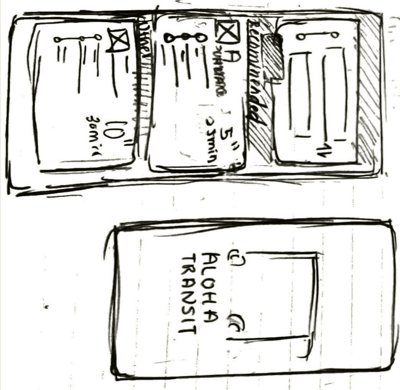
Sketches
Before creating a prototype I created sketches to get some ideas down.


04 Implementing
Making my idea come to life
Setbacks
Before I go into the designs, I want to mention that I actually had attempted this project back in summer of 2023. In my first attempt, I did not do enough research, set a scope or even create an information architecture before jumping into design. In the end, it did not necessarily address user pain points and ended up emulating existing designs way too much.

Prototype in summer 2023...

More protoypes in summer 2023...looked way too much like the Transit App also Dabus does not support displaying information of individual lines!
The Finals Designs
After picking up the project again on the winter of 2024, I really tried to address user pain points by retracing my previous steps in my first attempt but addressing steps I skipped out on (white paper research, information architecture, defining the scope, and sketching more).


05 Reflection
What would I do differently next time?
What I Learned
Don’t jump into designing
As mentioned, in my second attempt I prioritized the ground works before designing which made the final product more polished and actually achieve its goal.
Document Everything
However, even if the second attempt was successful, I failed to document each version of my design which is very important in terms of showcasing my iterations.
What I’d do
Add More Languages
Currently the app only supports English even though users have mentioned using other languages that the app does not support anymore.
Conduct User Testing
One of the biggest mistake I made in my second attempt was not doing any user testing before going into the final design.
© 2026 Aveline Wang
Made with love and black coffee 🖤