
WAHIAWA HEALTH AND WELLNESS ORGANIZATION
Brandy Identity Design
At a Glance
This client project was the capstone for my final year in the BFA Graphic Design program. Our entire class was given the same brief for the Wahiawā Health and Wellness Association (formerly Wahiawā General Hospital) and tasked with creating a new identity system and a book documenting it.
The catch? We all had to pitch our work to the “client” at the end, and only one design would be chosen.
Was mine selected? …Well, let’s just say scroll to the bottom to see!
Project Type
Client Project
Timeline
Dec. 2024 - Feb. 2025
Tools
InDesign, Illustrator, Photoshop
The Brief
Client: Wahiawā Health and Wellness Association
Goal: Rebrand from a traditional hospital to a community-driven health and wellness organization, while respecting their decades-long legacy.
Audience: Central Oʻahu residents (multi-generational), local investors, stakeholders, government, nonprofits.
Tone: Hope, future-focused, community connection, rural values, and self-reliance.
Must Keep: The name “Wahiawā” in the identity.
01 Research
To understand the organization and community, I explored:
Local health branding
Identified overused tropes to avoid (e.g., generic medical crosses, cliché heart icons)
Cultural & geographic landmarks
Identified key landmarks to incorporate culturally relevant and location-specific elements into the design
Core themes:
Defined key themes such as ʻĀina (land stewardship), resilience, progress, and belonging to guide the visual direction
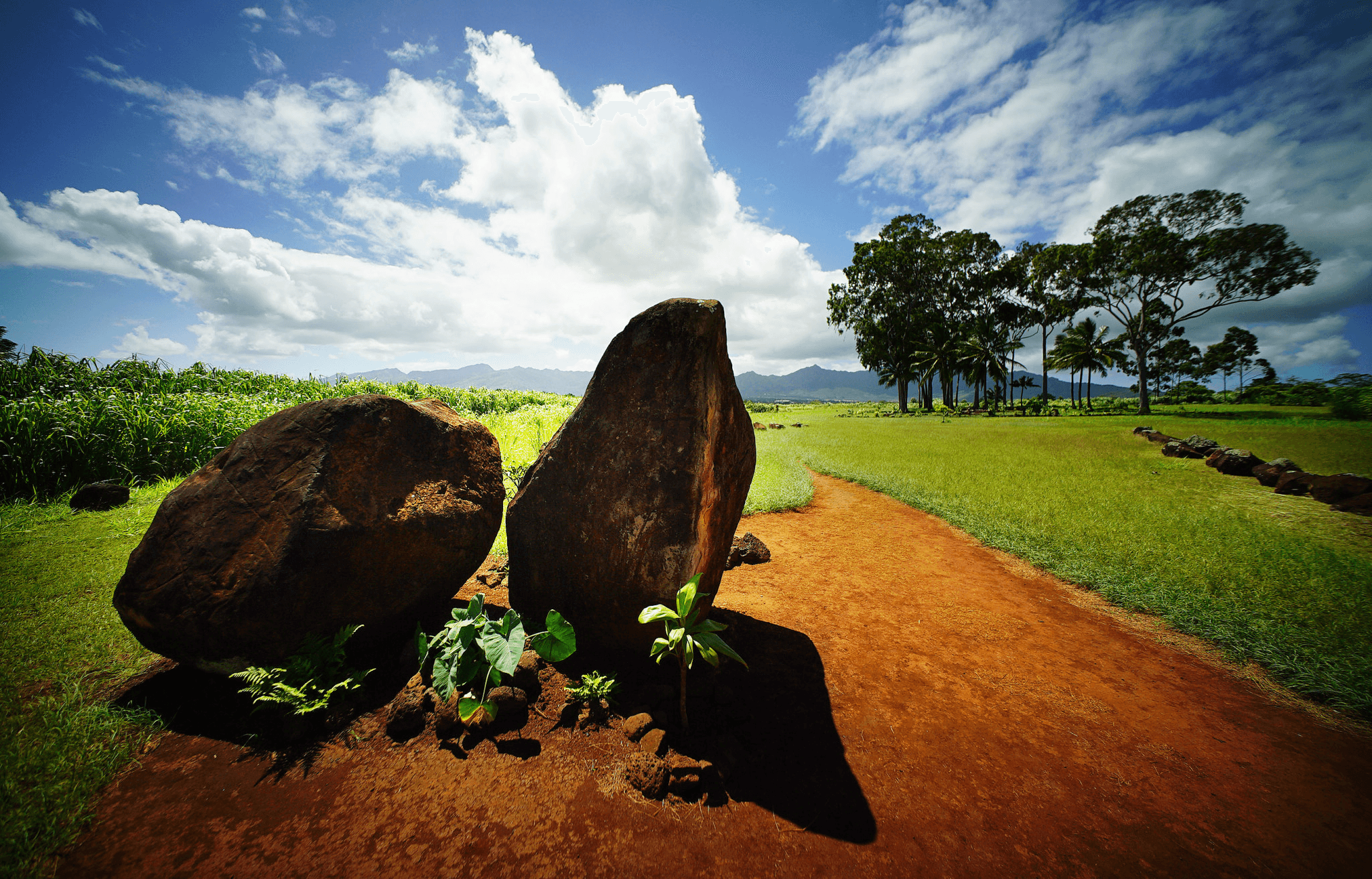
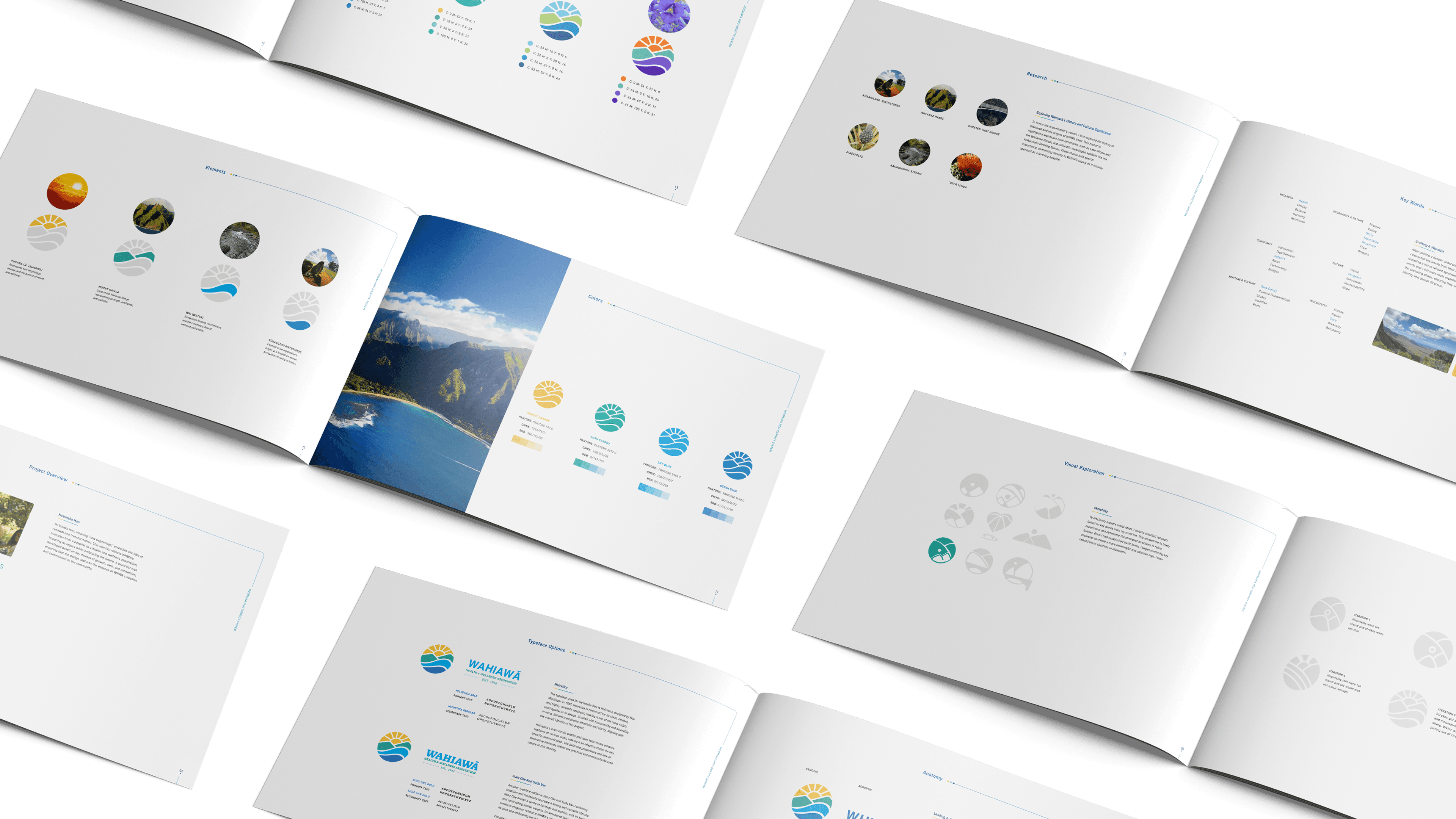
Key Landmarks
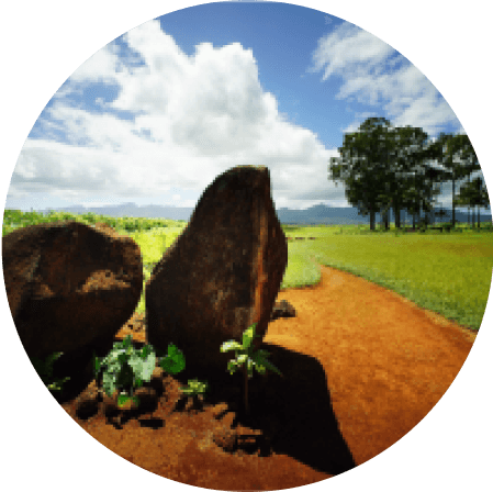
I began by researching Wahiawa to understand what makes it unique. This led me to key local landmarks like Lake Wilson and the Waiʻanae Range, as well as culturally significant sites such as the Kūkaniloko Birthing Stones. The stones hold deep cultural meaning and directly connect to WHWA’s history, as it originally operated as a maternal hospital.
Kūkaniloko Birthstones
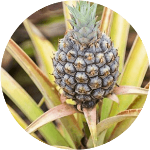
Pineapples
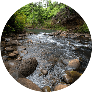
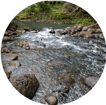
Kaukonahua Stream

'Ohi'a lehua
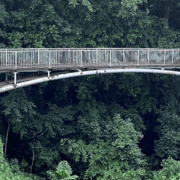
Karsten Thot Bridge
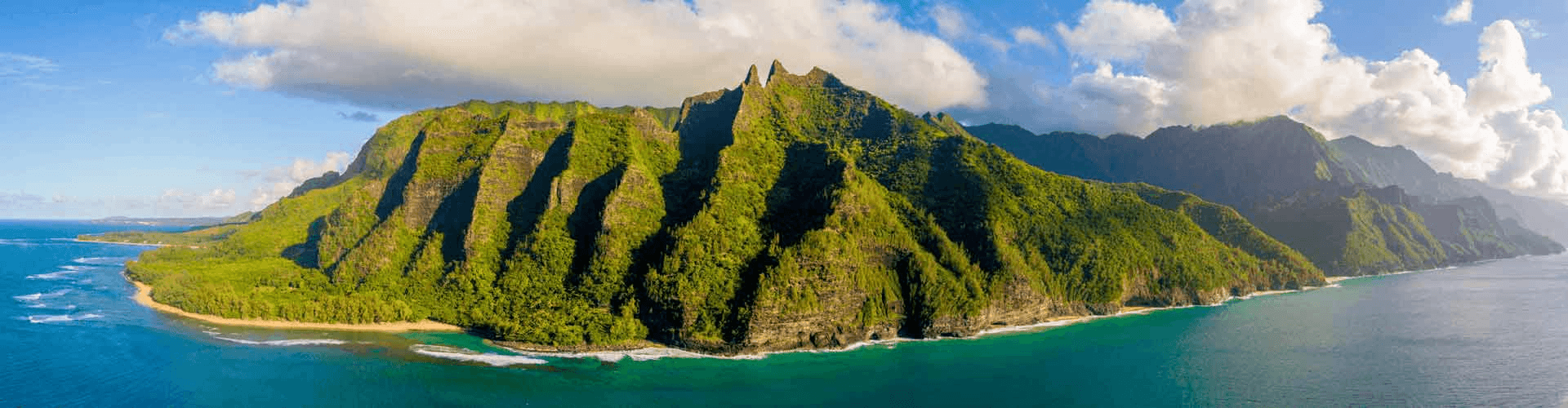
Waiʻanae Range
Wordlist
After gaining a deeper understanding of WHWA and their origin, I extracted key words from their mission statement and compiled a list of related synonyms. I then highlighted the words that I felt were most essential to keep in mind during the sketching phase, ensuring they would guide the visual identity and design direction.
Wellness
Health
Vitality
Balance
Harmony
Resilience
Geography & Nature
Plateau
Valley
Ohi’a
Mountains
Reservoir
Flow
Bridges
Community
Connection
Togetherness
Support
Roots
Partnership
Bridges
Heritage & Culture
ʻĀina (land)
Kuleana (stewardship)
Legacy
Tradition
Roots
Future
Vision
Progress
Innovation
Sustainability
Hope
Inclusivity
Access
Equity
Care
Diversity
Belonging
02 Development
I started with sketching and iterating from there.
Sketches
I first explored various logo concepts by combining motifs such as the sun, kalo leaf, mountains, and bridges. Based on the client’s preference, the design direction focused on a circular form.
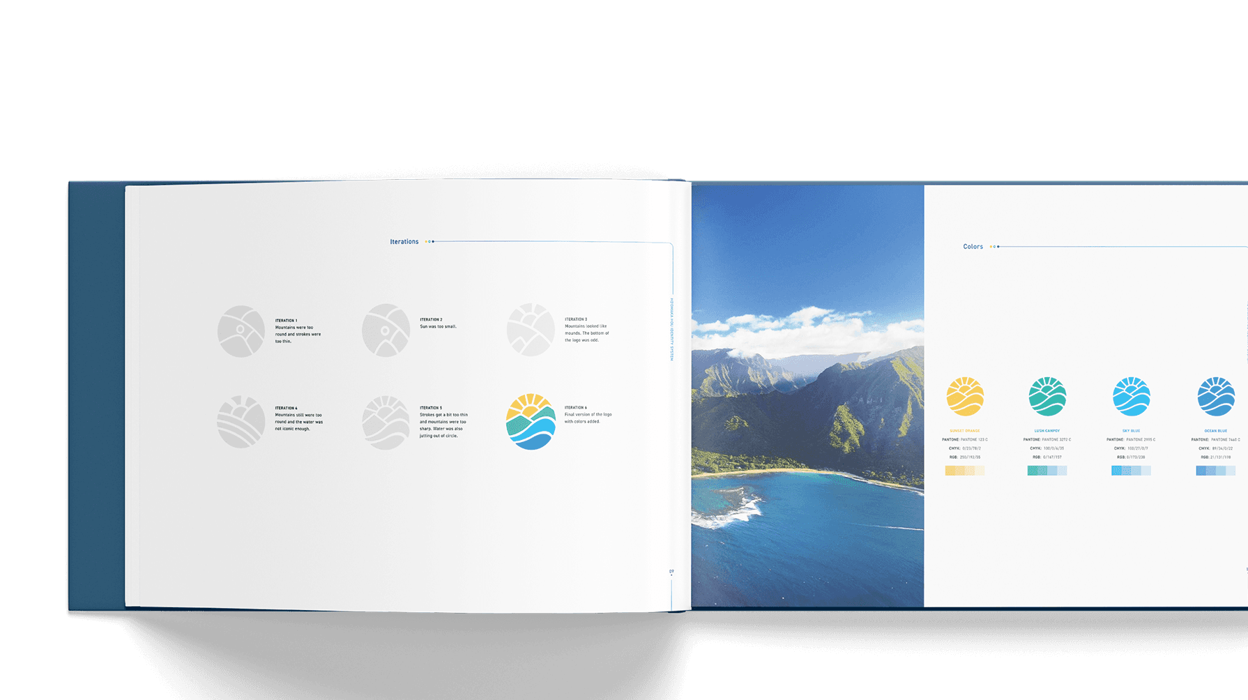
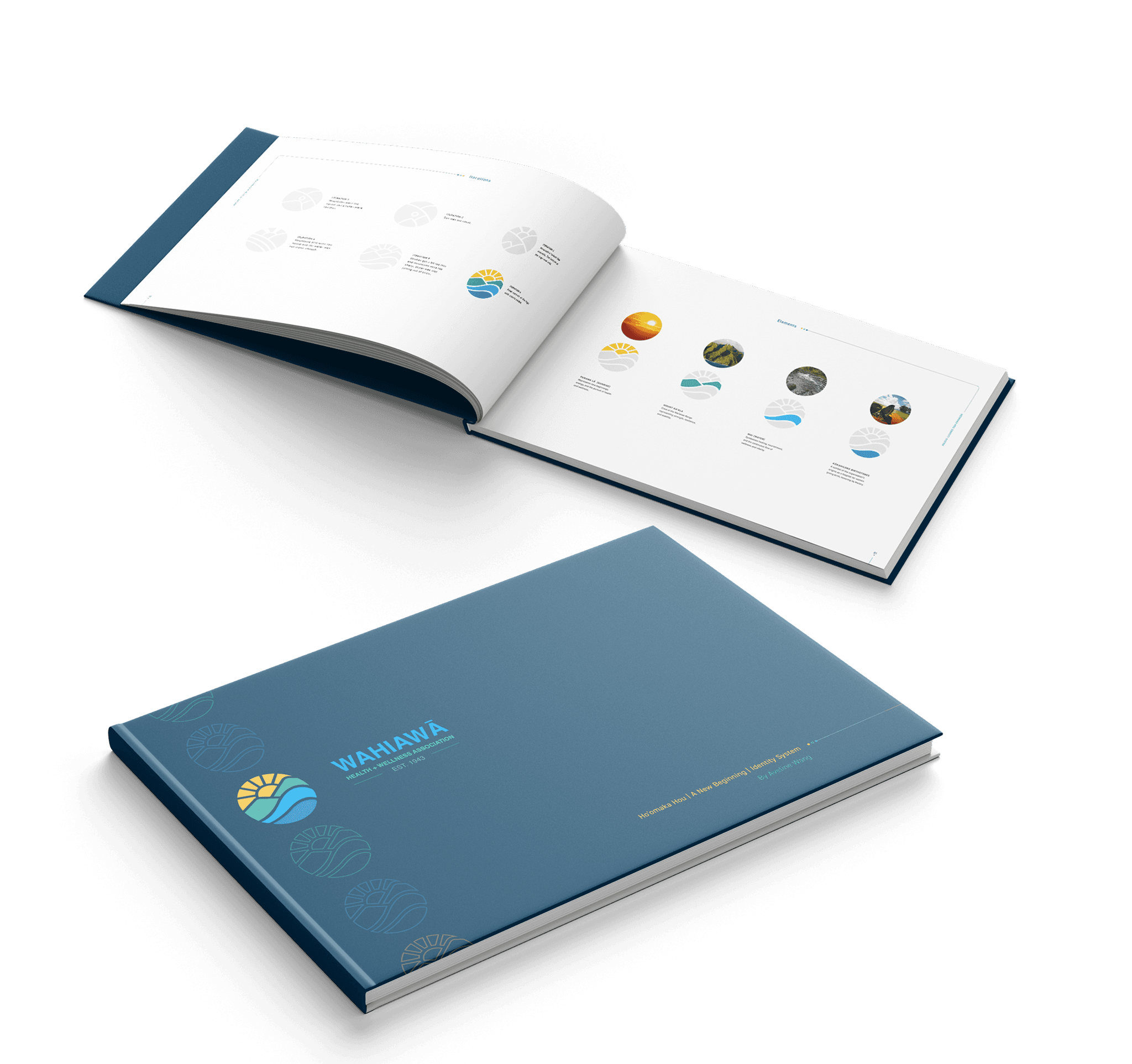
Iterations
Once I had my idea in place, I refined it through iterations based on my professor’s feedback. Early on, some of my main issues were strokes that were too thin and a lack of clear direction, which often made the logos either too abstract or unintentionally resemble something else. Through multiple revisions, I adjusted stroke weight, clarified forms, and ensured each design aligned with the intended concept.
ITERATION 1
Mountains looked like mounds. The bottom of the logo was odd.
ITERATION 2
Sun was too small.
ITERATION 3
Mountains were too round and strokes were too thin.
ITERATION 4
Mountains still were too round and the water was not iconic enough.
ITERATION 5
Strokes got a bit too thin and mountains were too sharp. Water was also jutting out of circle.
ITERATION 6
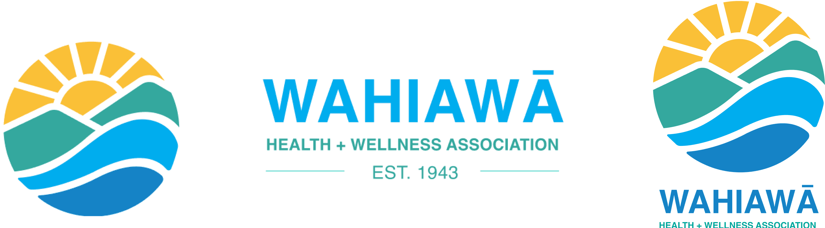
Final version of the logo with colors added.
03 Final Identity System
Elements

Colors
Sunset orange
Pantone: Pantone 123 C
cmyk: 0/23/78/2
rgb: 250/192/55
Sky Blue
Pantone: PANTONE 2995 C
cmyk: 100/27/0/7
rgb: 0/173/238
Lush Canpoy
Pantone: Pantone 3272 C
cmyk: 100/0/6/35
rgb: 0/167/157
Ocean blue
Pantone: PANTONE 7460 C
cmyk: 89/34/0/22
rgb: 21/131/198
Typography
For the typography, I chose Helvetica for its even stroke widths and open letterforms, which enhance legibility at various sizes and make it effective for the brand’s communication. Its balanced proportions and simplicity also reflect the practical, community-focused nature of the identity.
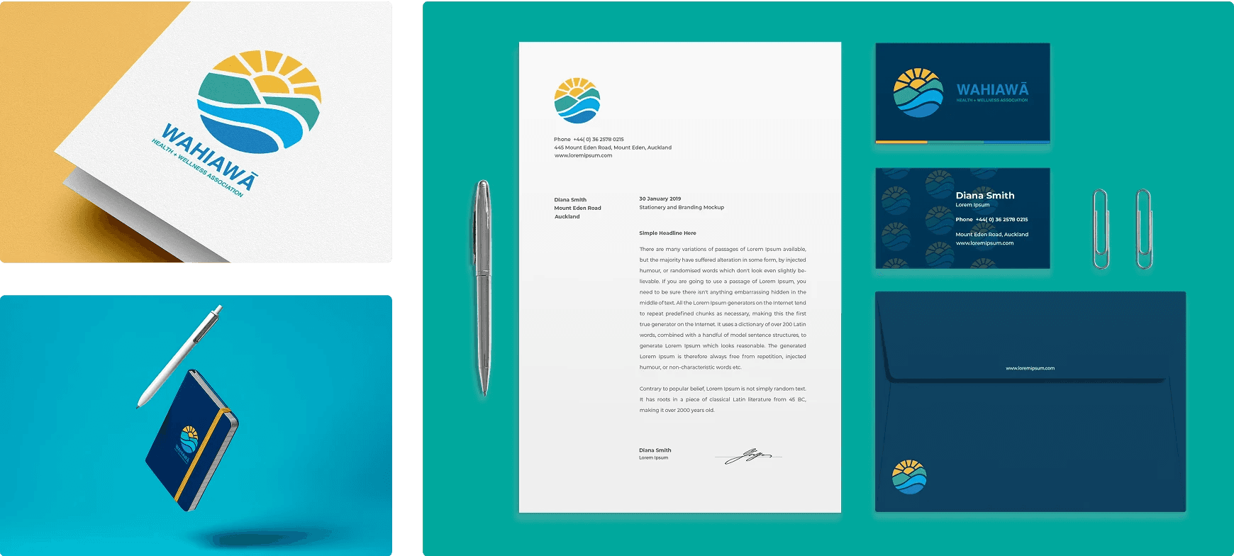
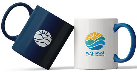
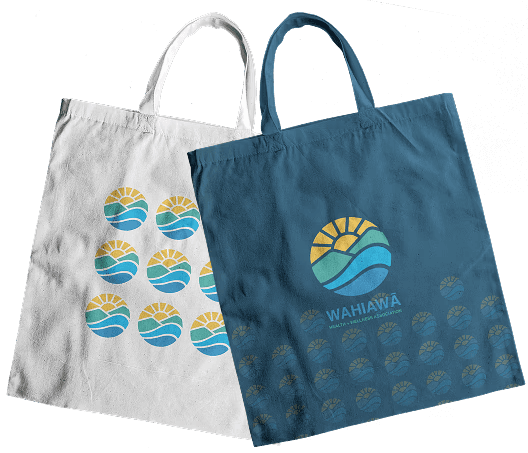
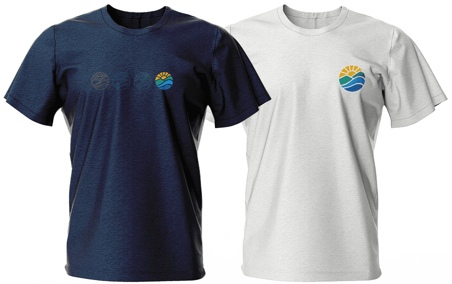
03 Applications
Stationery, website and print materials.

04 Reflection
My design was not chosen. However…
this project was a valuable learning experience in logo design and brand identity development. Early iterations of my work were overly detailed and resembled miniature illustrations rather than functional logos. Through refinement, I gained a stronger understanding of creating marks that balance clarity, scalability, and conceptual depth, often embedding multiple meanings or narratives within a single symbol.