Modernizing the University of Hawaiʻi’s job platform for Employers
Project Overview
Redesigning the employer side of SECE and building the component library that now underpins both the employer and student experiences.
Project Type
Internship
Contributions
UX Research
UI & Visual Design
Design System
Interaction Design
Timeline
5 months
Tools
Figma
Illustrator
THE PROBLEM
A Functional Platform Held Back by an Outdated Interface
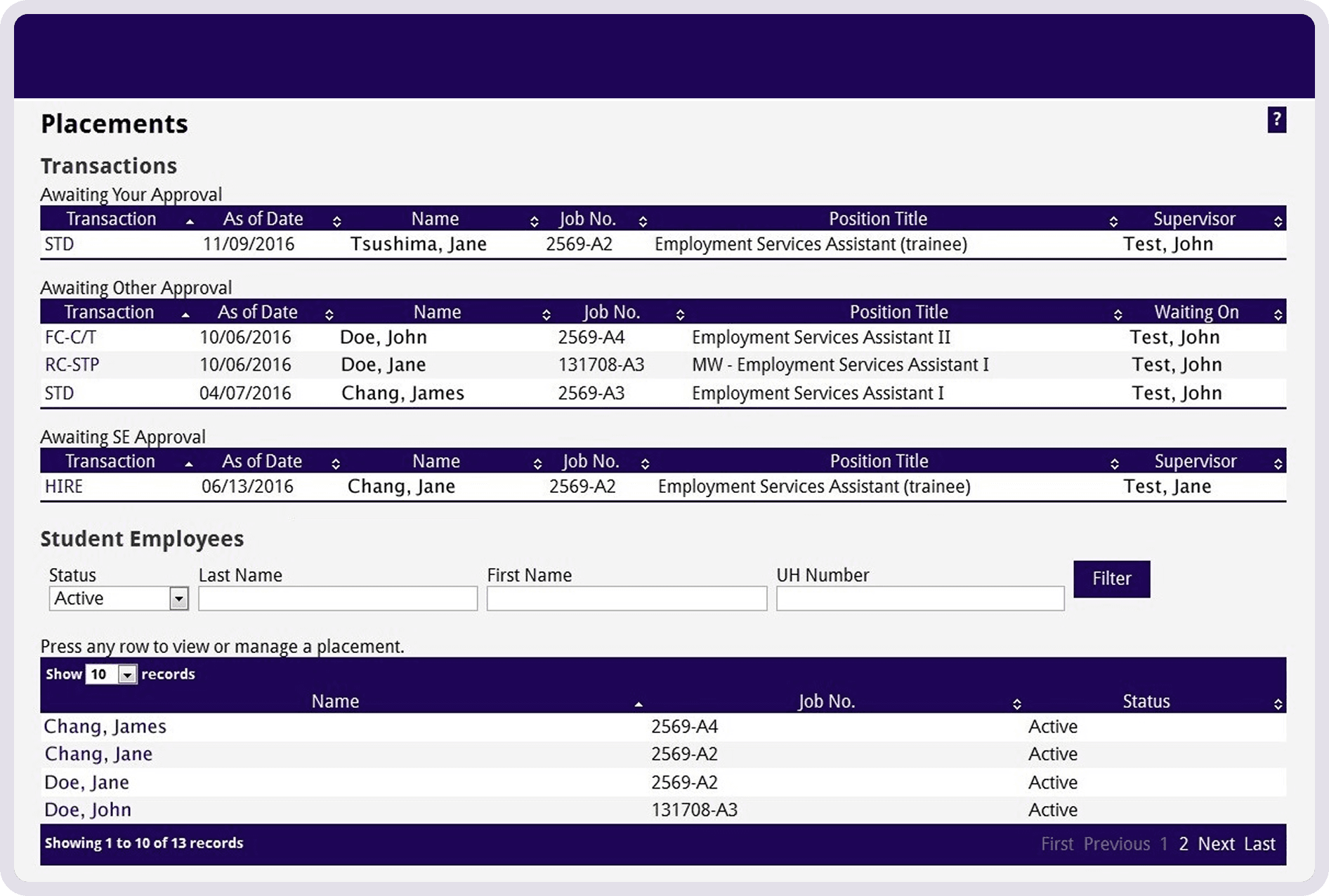
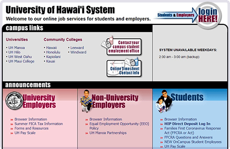
SECE had been serving UH students and employers for decades, but its aging interface created unnecessary friction. Employers struggled to complete key workflows, and the UI no longer reflected the university’s brand or digital standards.
Working with SECE staff and using Nielsen’s heuristics as a framework, I evaluated the existing platform and identified three core issues.
RESEARCH
How other platforms handle dense data and brand consistency.
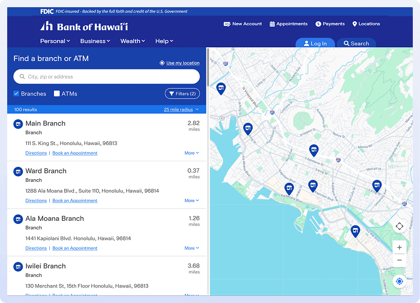
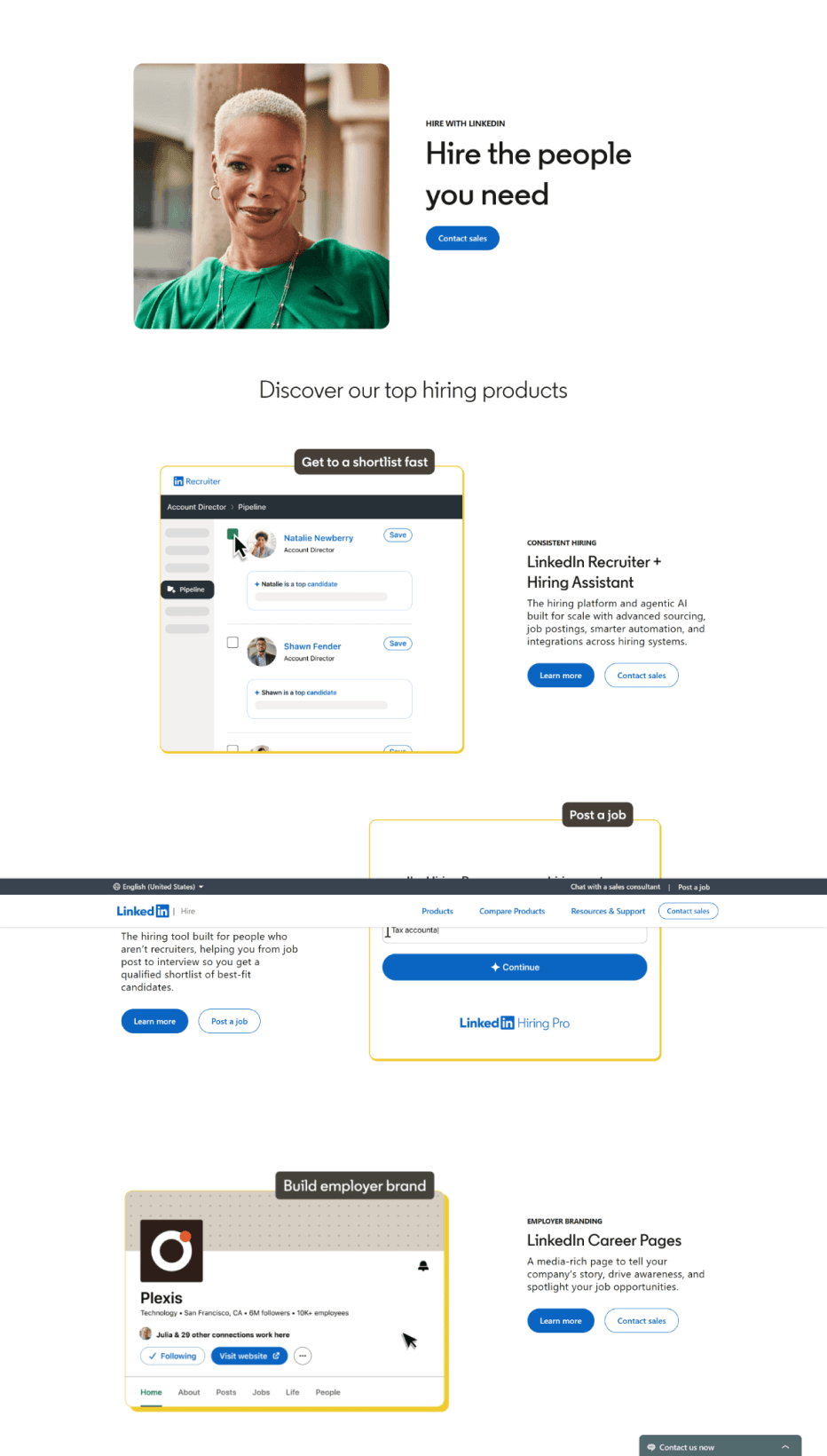
To address these friction points, I looked at how leading university and employer platforms handle data-heavy screens and brand consistency.
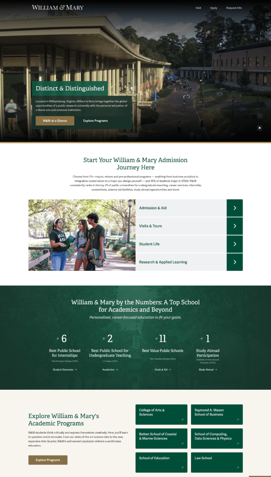
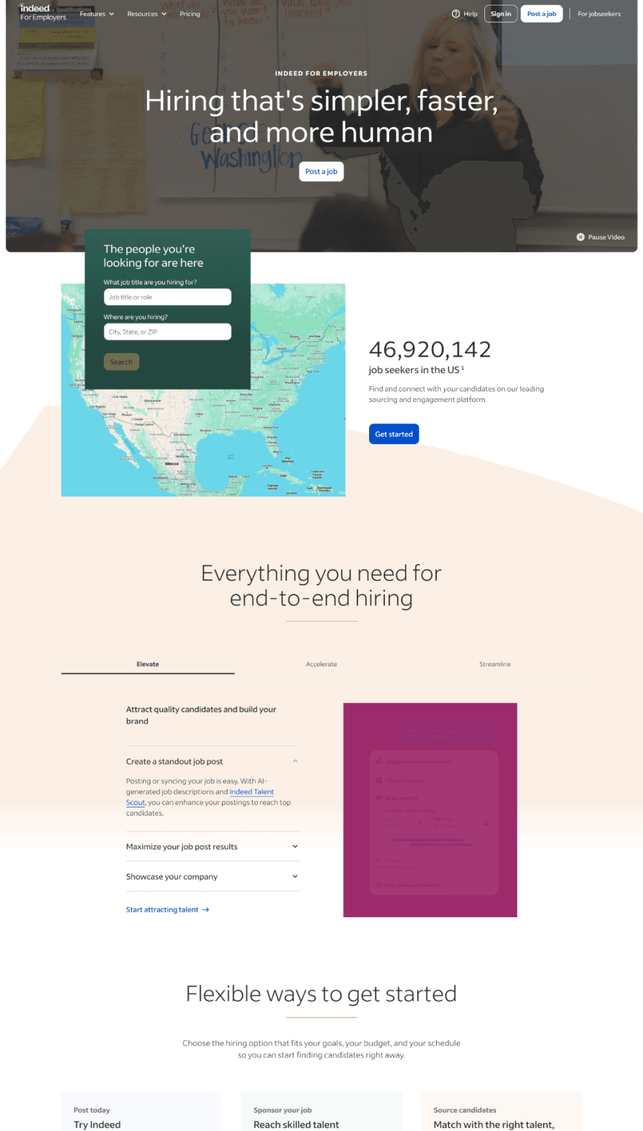
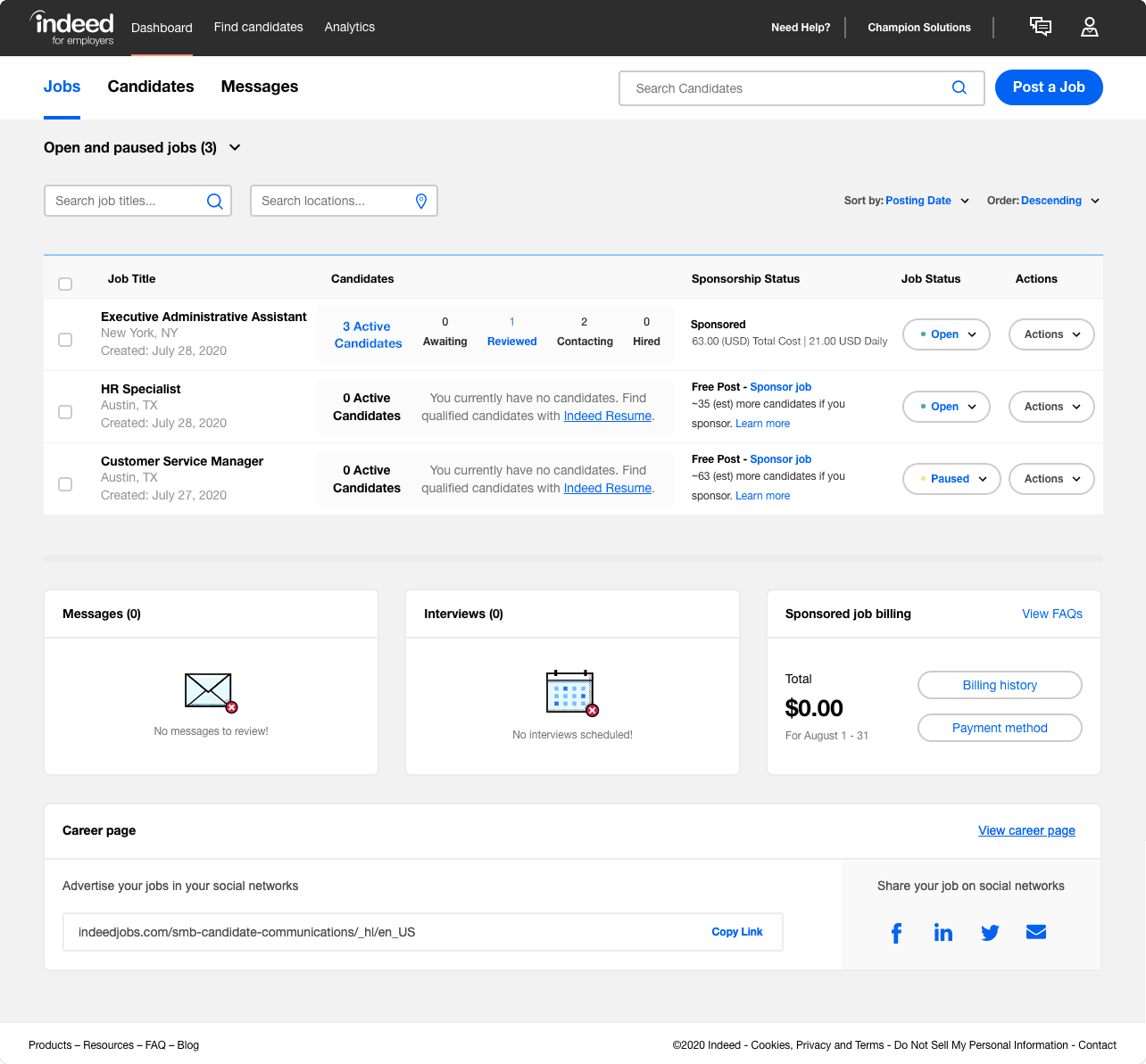
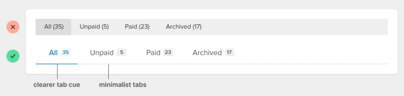
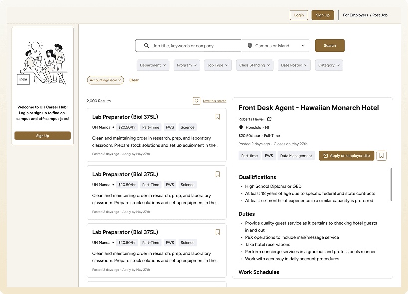
Navigation bar doesn’t have to look like a bar
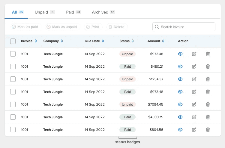
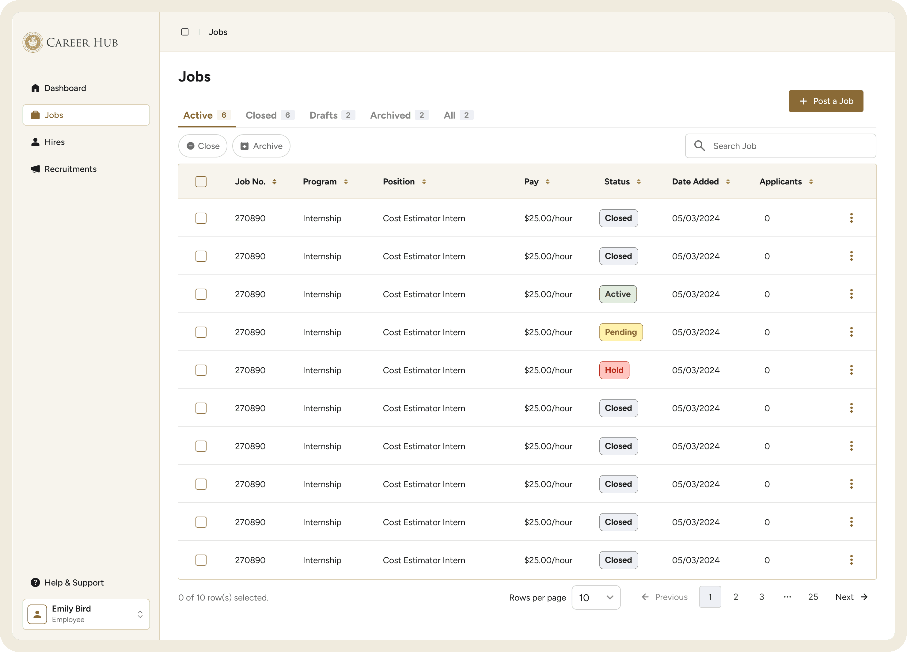
Use badges for status data.
Screenshots of the platform paired with feature highlights
Platform credibility stats (student count, campus reach, etc.)
Color coded action items
Stylized Tables
Brand color for CTAs
Separate entry points for employers and job seekers
PROCESS
Planning My Approach
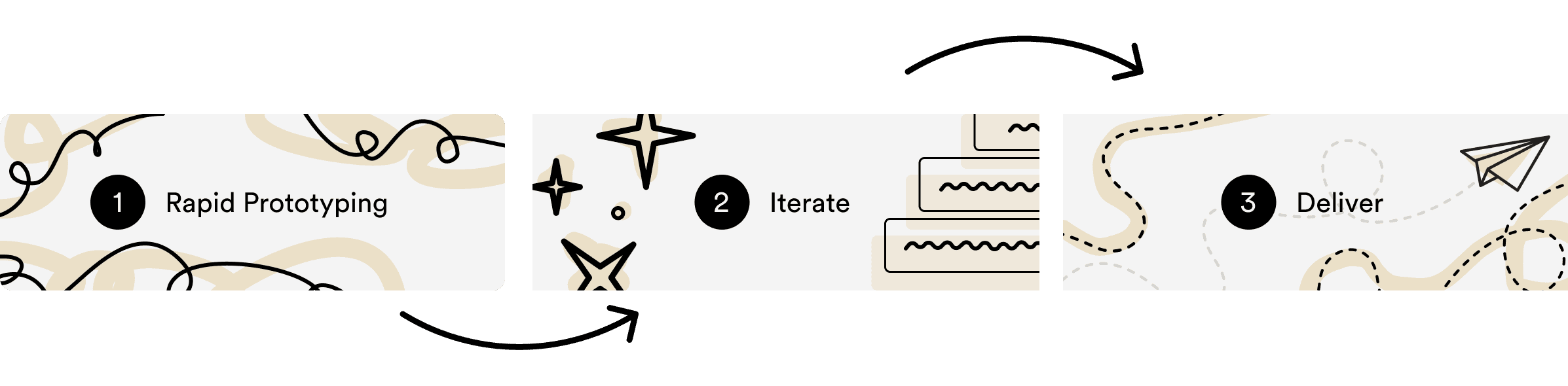
Given the internship timeline, I moved directly into high-fidelity design, iterating as I went.
SETBACKS
My first iteration did not hold together.
Designing in high fidelity without an established component library slowed me down and introduced inconsistencies across screens. The first iteration also failed AAA contrast compliance.
I rebuilt the system using Shadcn as a foundation. Once the components were in place, the process became significantly faster and the designs more cohesive.
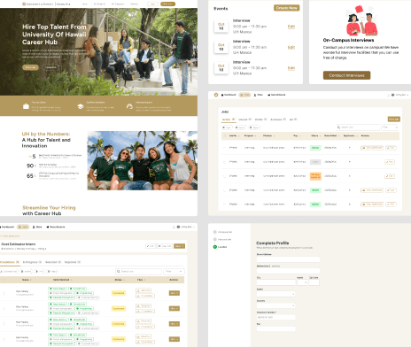
Failed to meet AAA compliance
No established design system
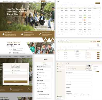
Meets AAA compliance
Established design system
NEW DESIGN SYSTEM
Rebuilding the Component Library
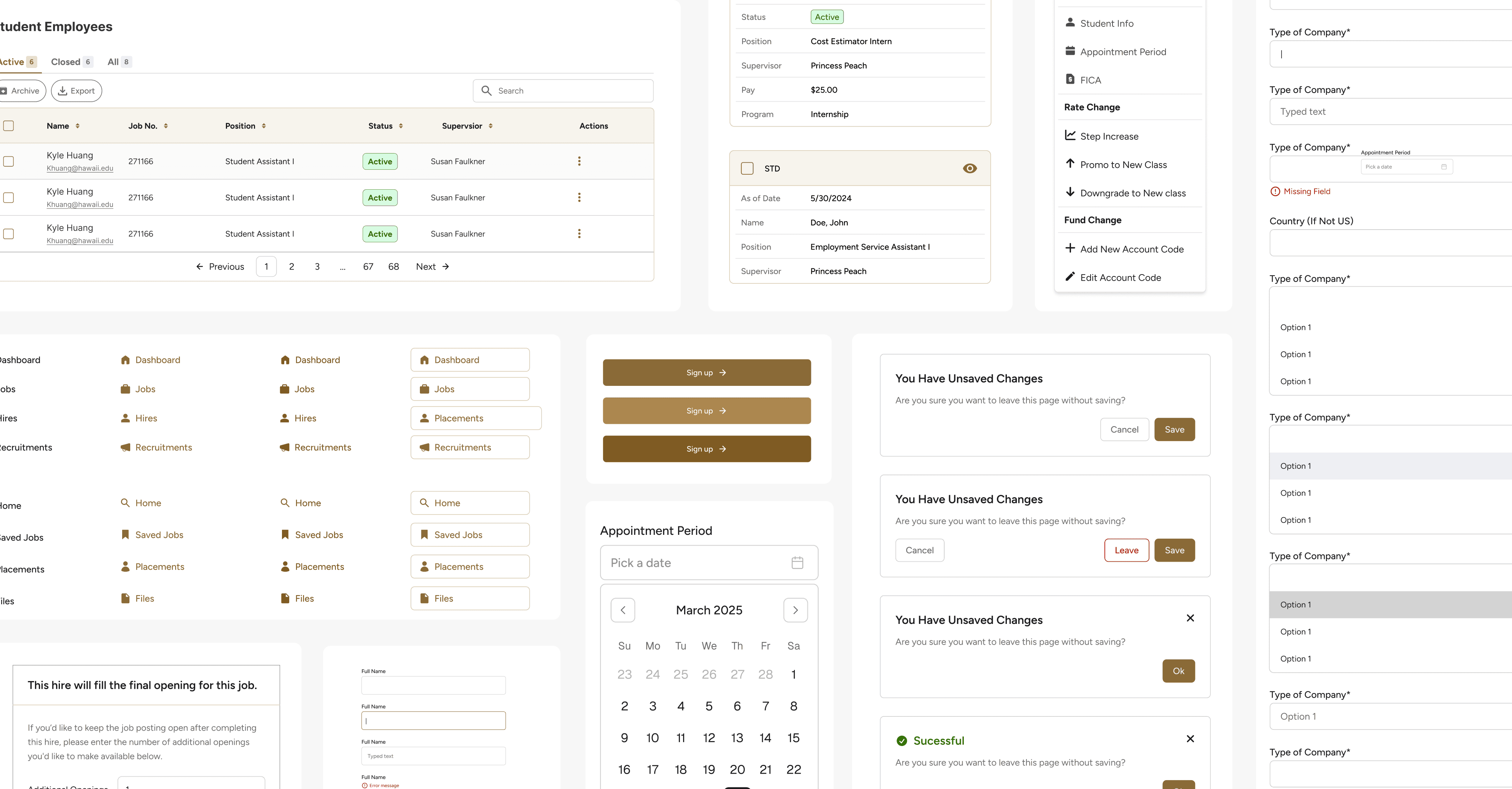
The final library includes around 20 core components: button variants, form inputs with all interactive states (default, focus, error, disabled), color-coded status tags, modals, side panels, alert dialogs, illustrated empty states, and data tables.
All components meet WCAG AAA contrast standards and are fully annotated in Figma for developer handoff.
Handoff
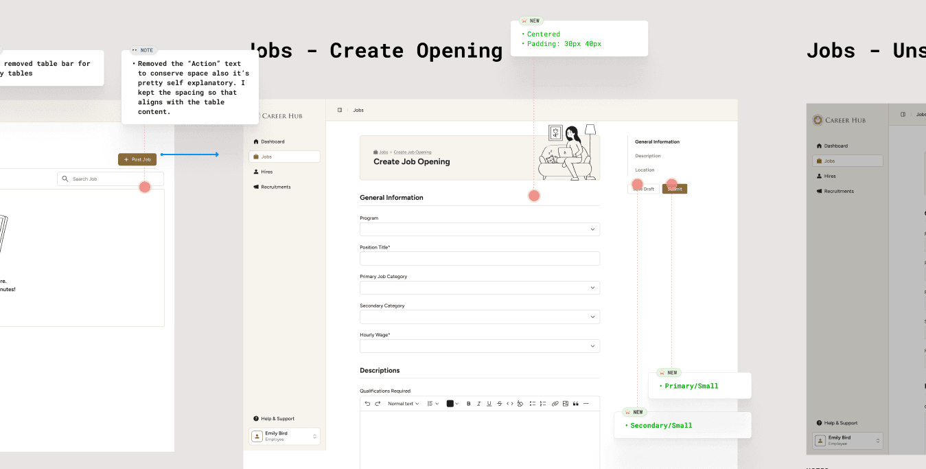
Since this project had a short timeline and was being built with one developer, I focused on making the Figma file easy to navigate and implement from.
Because the developer was already comfortable using Figma Dev Mode, I did not manually redline every spec. Instead, I organized the student flows into separate pages, labeled key states, annotated important interactions, and placed component references and breakpoint sizes near the screens.
This helped make the handoff clearer while keeping the file practical for development.
Final Designs
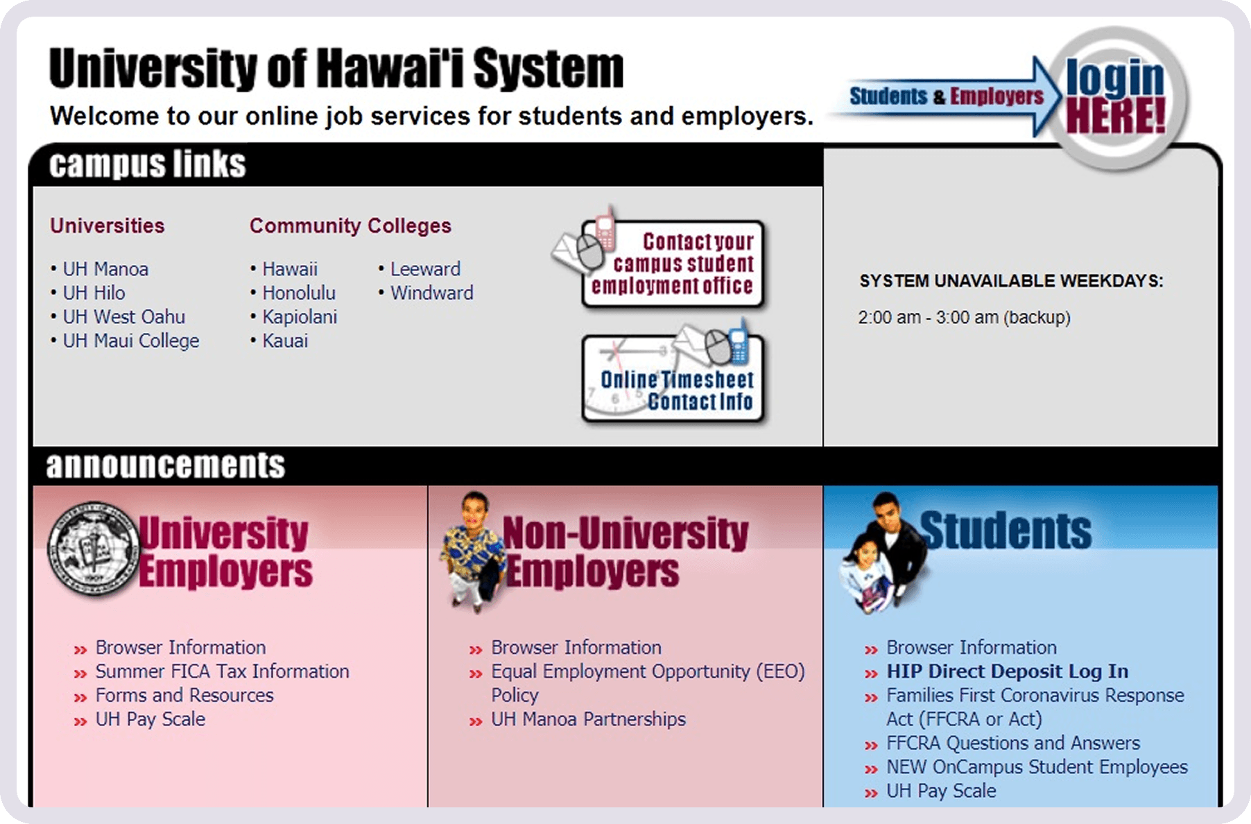
Outdated and no longer reflected UH’s current brand. Information was cluttered with no clear hierarchy.
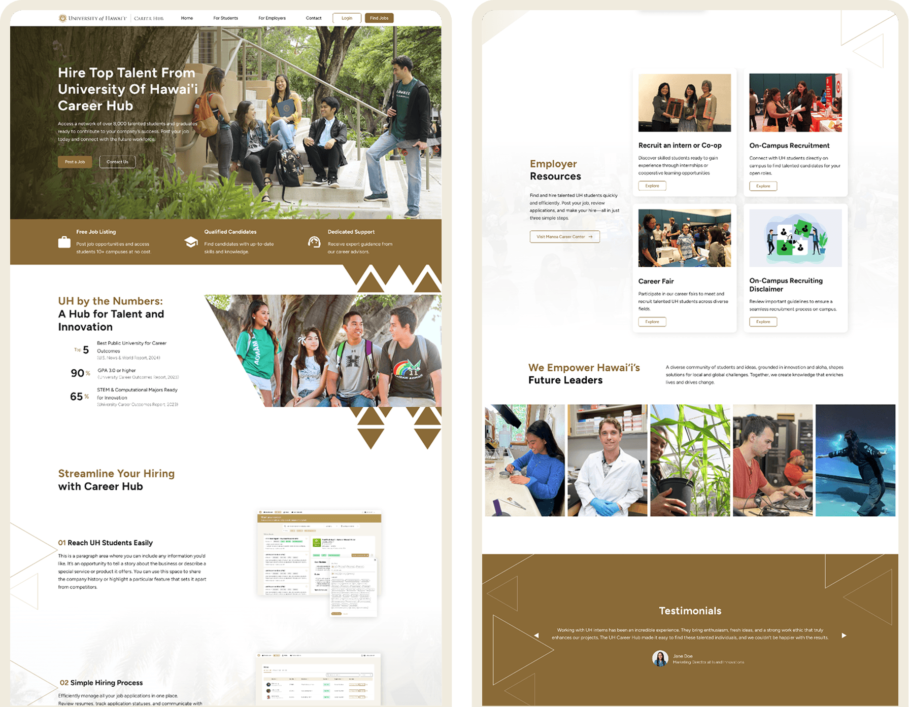
Follows the new design system and highlights Career Hub’s features.
Forms
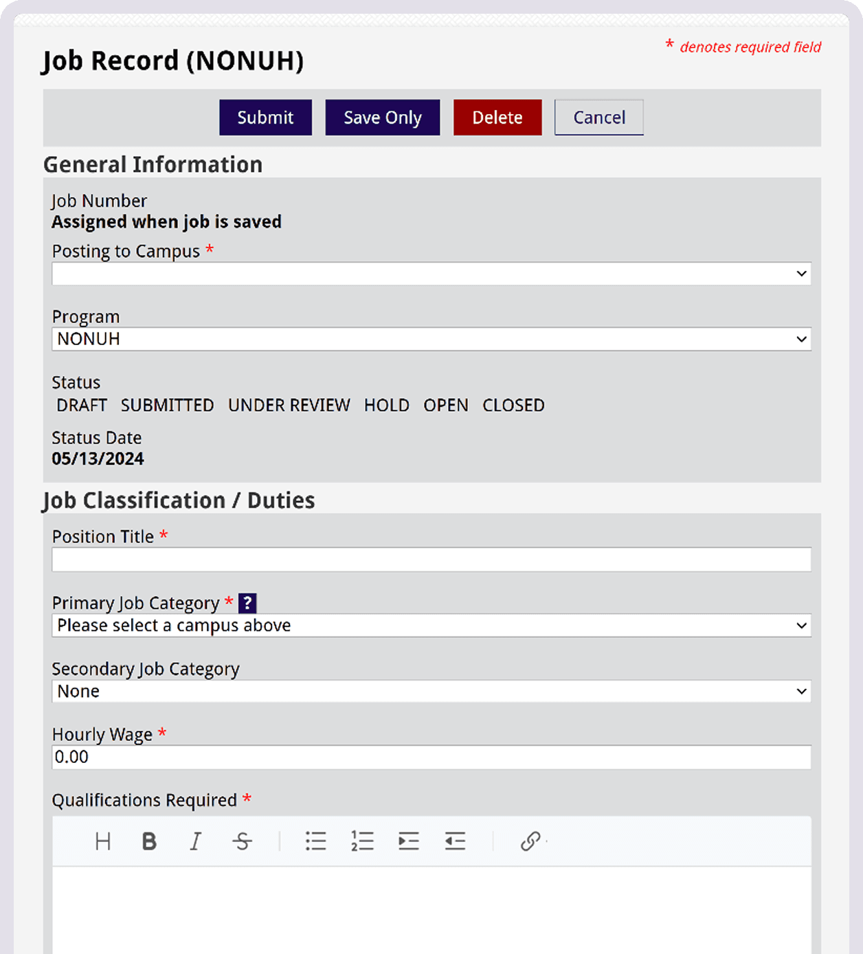
Forms were long, unstyled, and offered no navigational aid. Error states were unclear, and optional fields were not labeled as such.
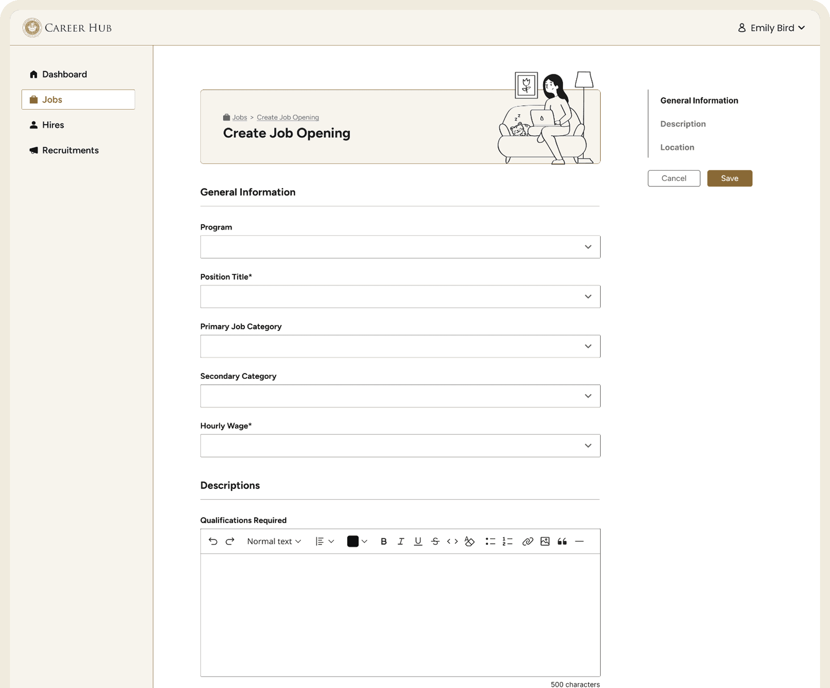
Better organization, side navigation for jumping between sections, and clear error states.
Employer Dashboard
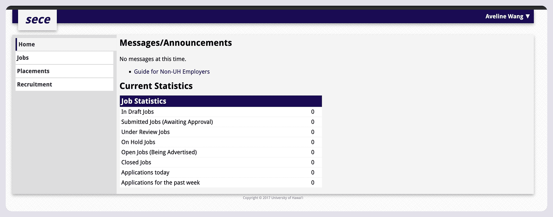
No visual hierarchy.
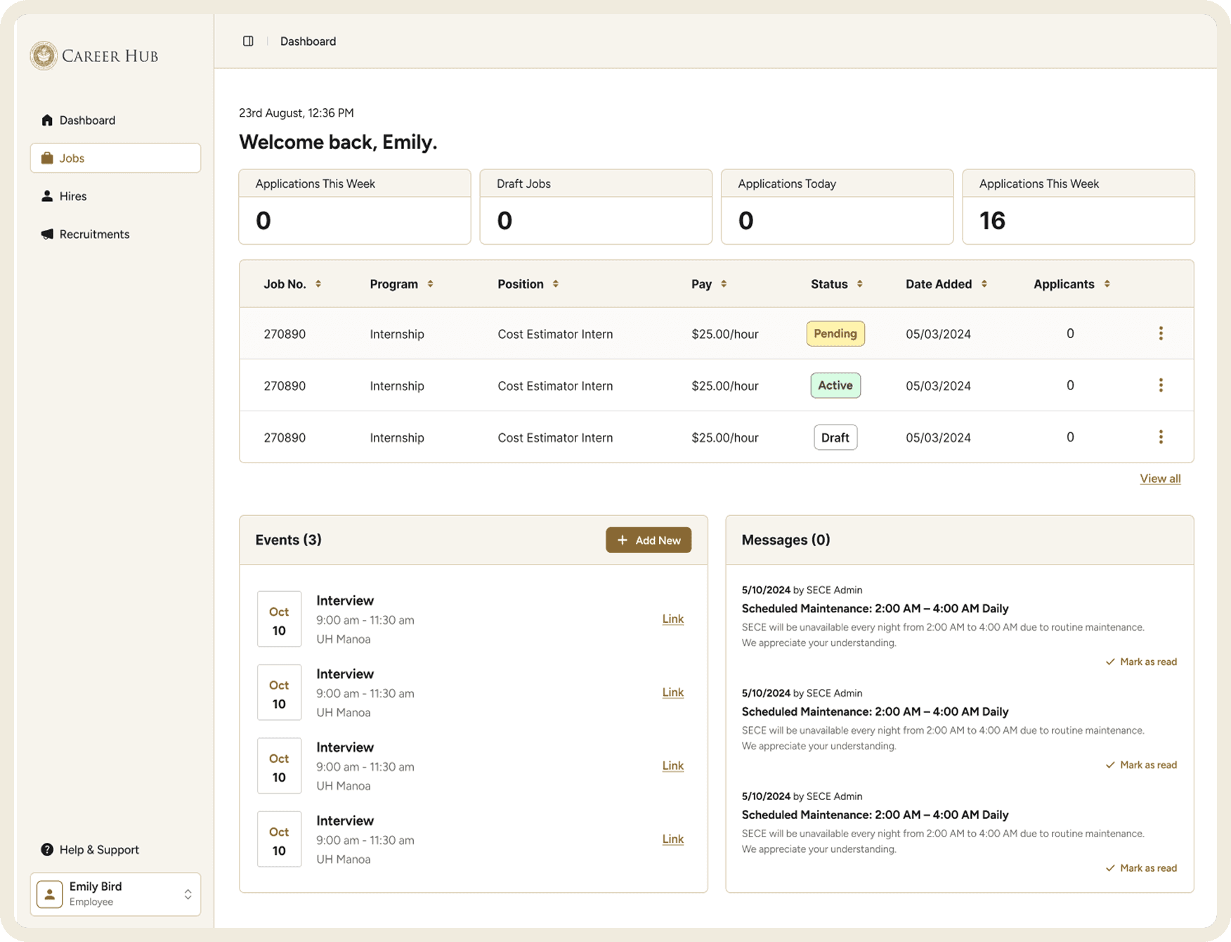
Manage job postings, track applications, and access recruitment tools all in one place with scannable stat cards and a live jobs preview table.
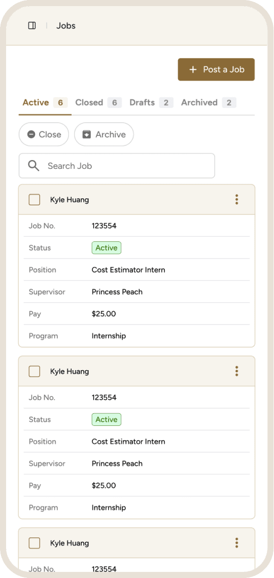
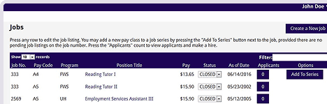
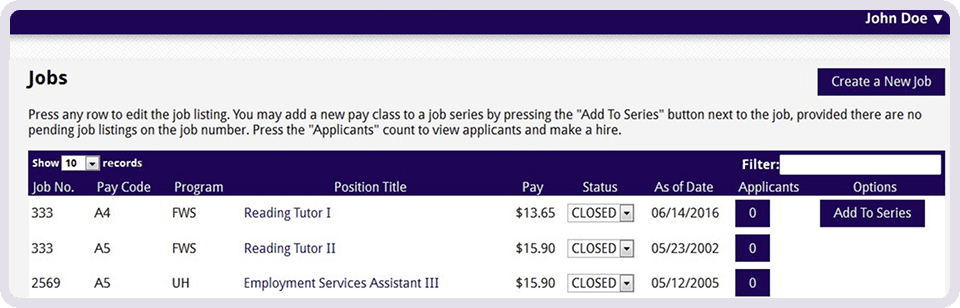
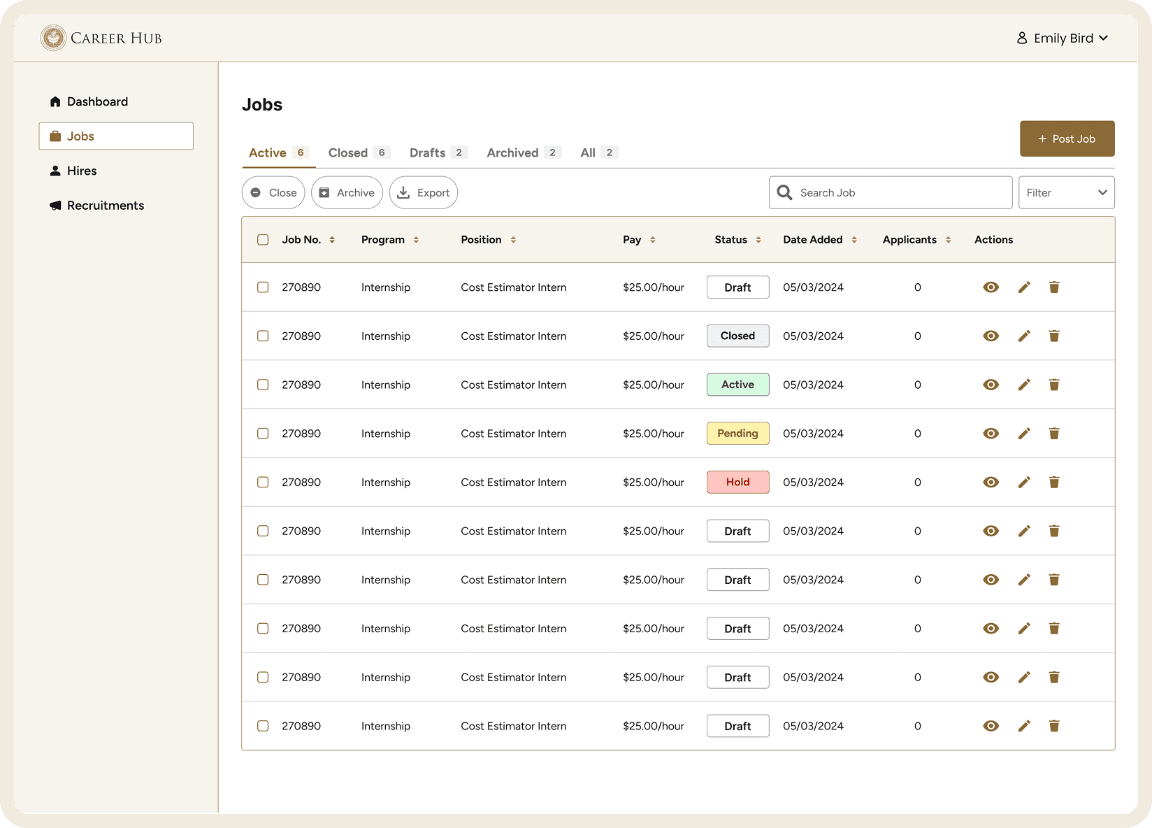
Jobs
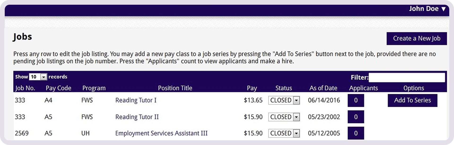
Jobs table was dense and hard to parse.
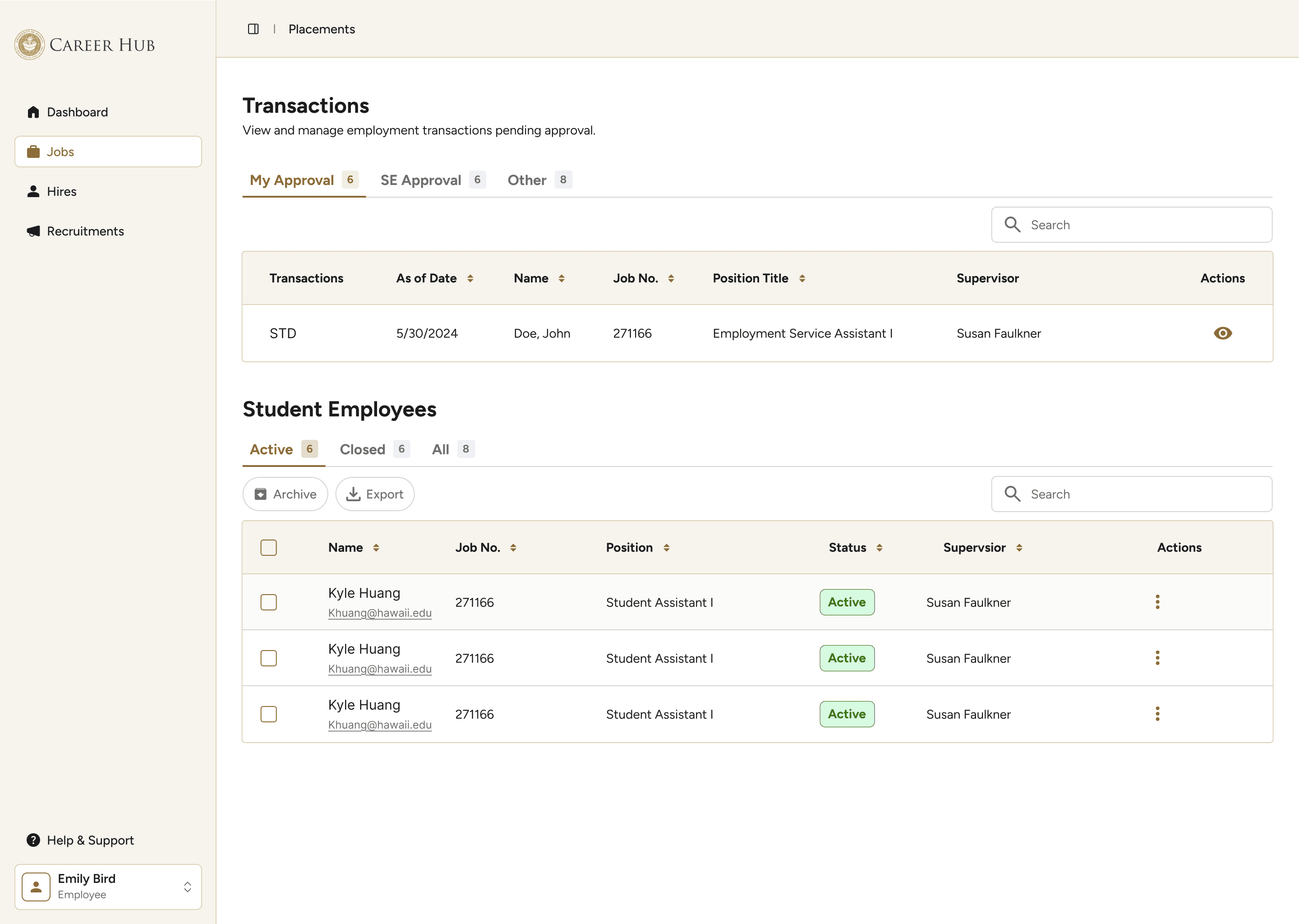
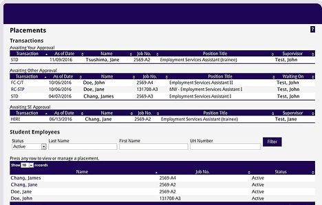
Placements
Actions were buried inside individual records, requiring employers to navigate away from the table, scroll to the bottom, and create a new transaction just to make a change.
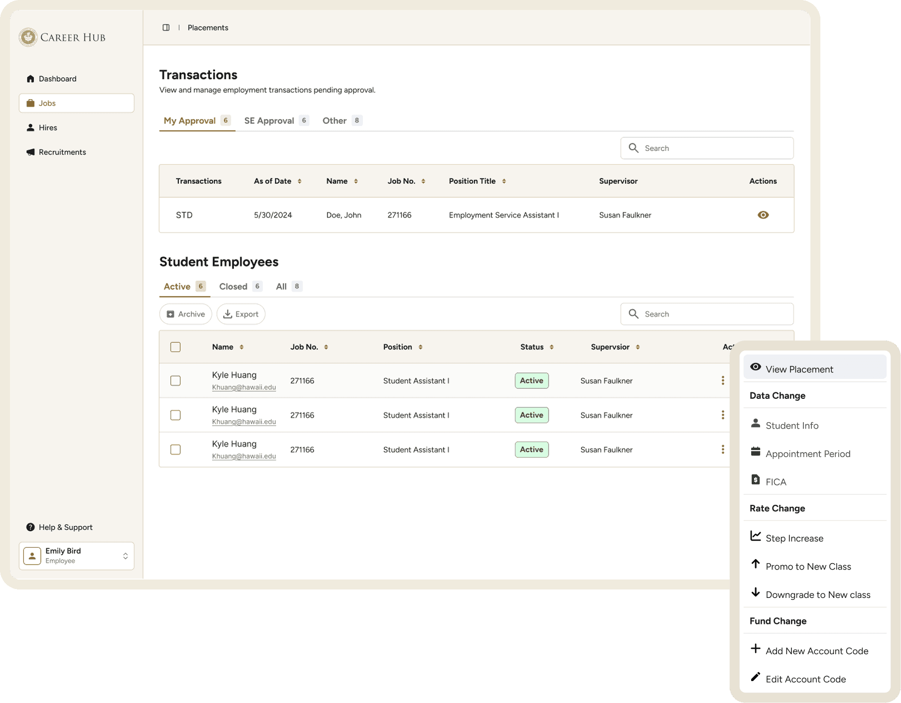
Actions now surface directly from the table via a three-dot menu with labeled categories and matching icons. A side modal handles all data edits so employers can make changes without losing their place in the table.
On-Campus Recruitment
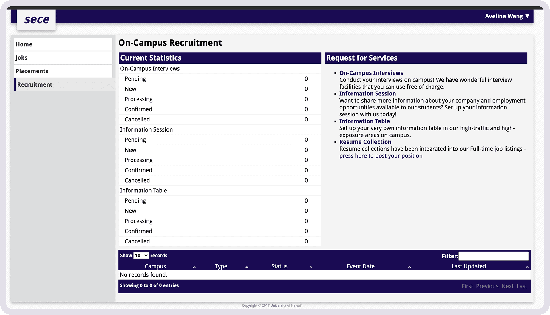
A dense statistics table and a list of plain text links make it difficult to quickly understand what services were available.
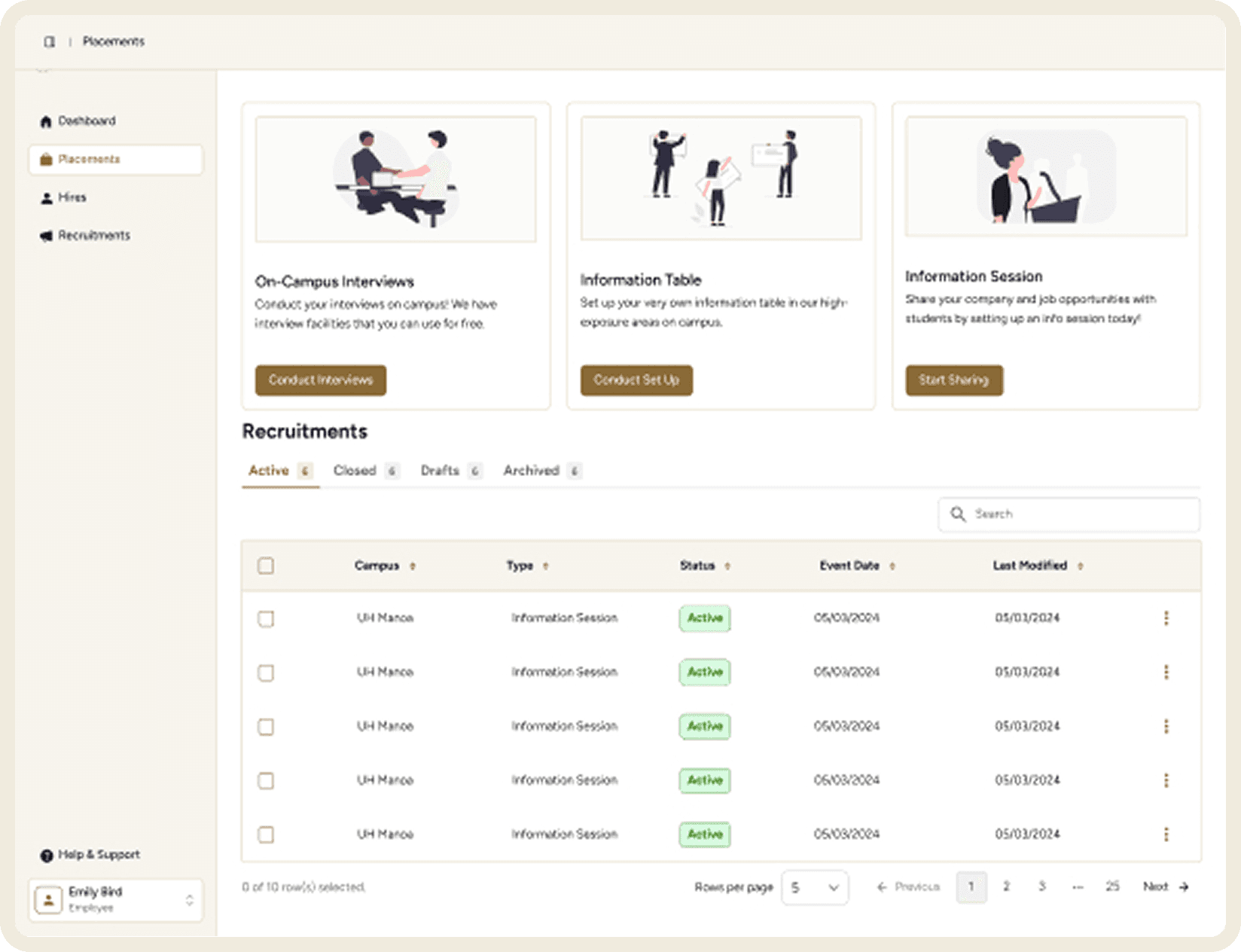
Illustrated action cards make available services immediately clear.
Reflection
This project taught me a lot about what I’d prioritize differently next time.
Research first: I would have spoken directly with on- and off-campus employers rather than relying on staff feedback and my own observations.
Align with the developer earlier: Knowing which UI framework the developer was most comfortable with from the start would have saved significant time.
Start with a UI library: Building from an established component library from day one — with proper documentation and ideally published in Storybook — would have produced a more consistent result and a smoother handoff.
Documenting everything from the start would’ve made writing this case study easier.