Helping UH Students Find Jobs That Fit
Project Overview
Redesigning the student side of SECE, the University of Hawaiʻi’s job platform, so students can quickly tell which campus jobs fit their schedule, eligibility, and goals.
Project Type
Contributions
UX Research
UI & Visual Design
Design System
Interaction Design
Timeline
5 months
Tools
Figma
Illustrator
Team
Kyle Hannigan, Developer
Jenny Chow, Project Manahger
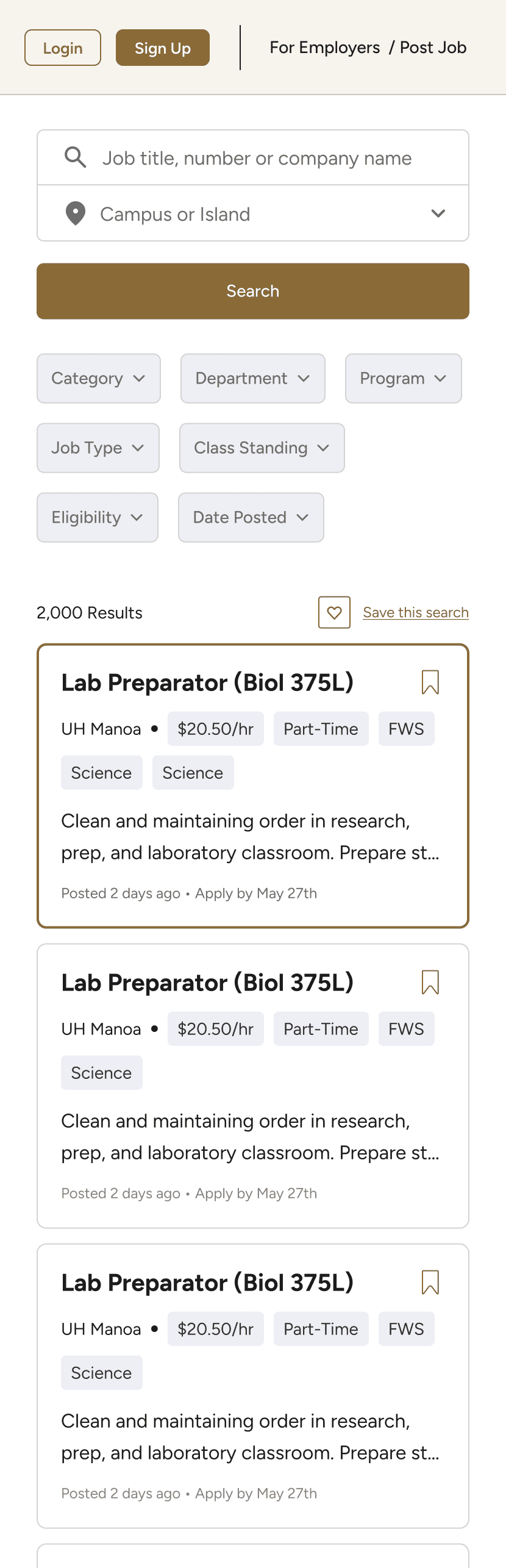
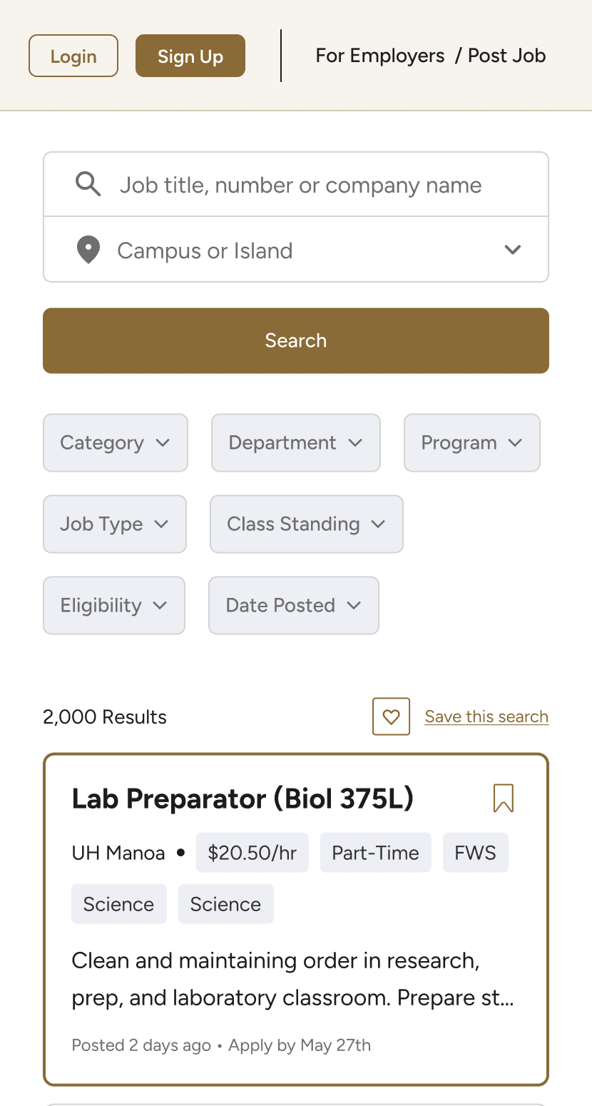


DISCOVERY
Students Needed Jobs That Fit Their Schedule, Eligibility, and Goals.
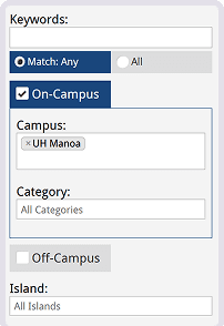
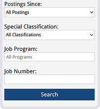
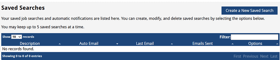
To understand how students actually use SECE, I conducted moderated interviews with 9 UH students — including freshmen, seniors, working students, international students, student staffs and recent graduates — to learn how they search for campus jobs and what gets in their way.
I found that students were not just looking for any job. They were looking for jobs that fit their class schedules, financial needs, transportation constraints, experience level, and long-term goals.
To synthesize the interviews, I organized participant quotes through affinity mapping. Each participant was assigned a different sticky note color, which helped me see which patterns appeared across multiple students.

Using AI
I first synthesized the interview data manually, then used AI to compare themes and check for gaps. The overlap between both syntheses helped validate my findings, while my manual process gave me a deeper understanding of the student pain points.
Key Findings

HOW MIGHT WE…
Help students quickly identify campus jobs that fit their schedule, goals, and eligibility?
I identified three design goals to guide the redesign:


COMPETITIVE ANALYSIS
How established job platforms make large lists scannable.
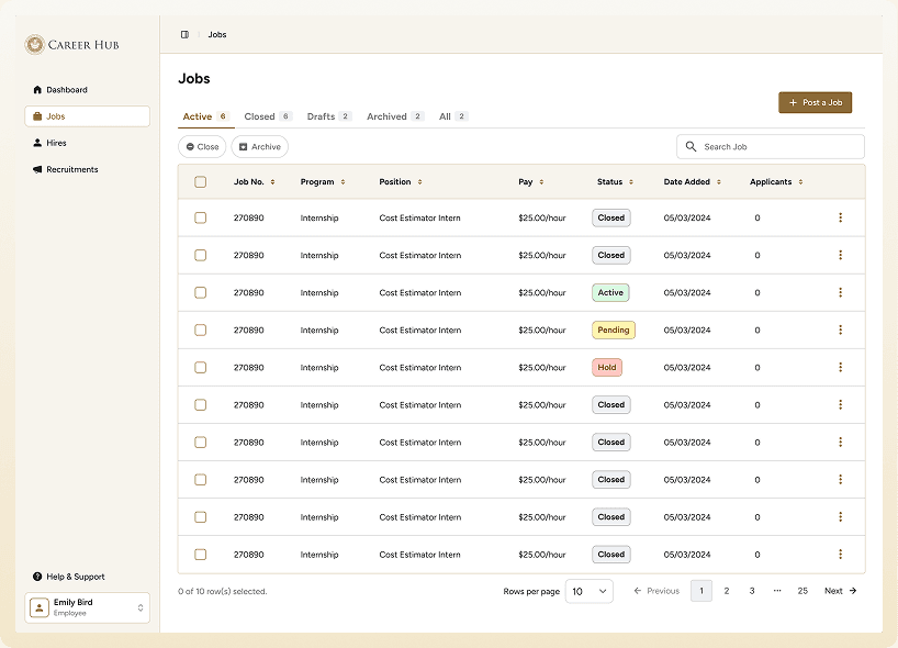
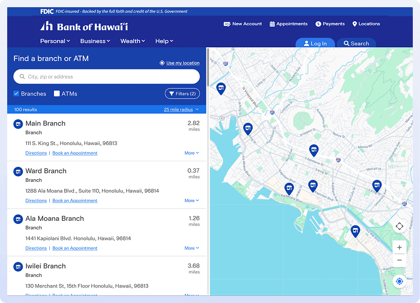
To understand common interaction and layout patterns in job search, I reviewed Indeed, ZipRecruiter, and Handshake. I focused on how each makes large sets of listings easier to scan and evaluate: split-view layouts, top-level filters, condensed job cards, highlighted tags, and structured job-detail panels.
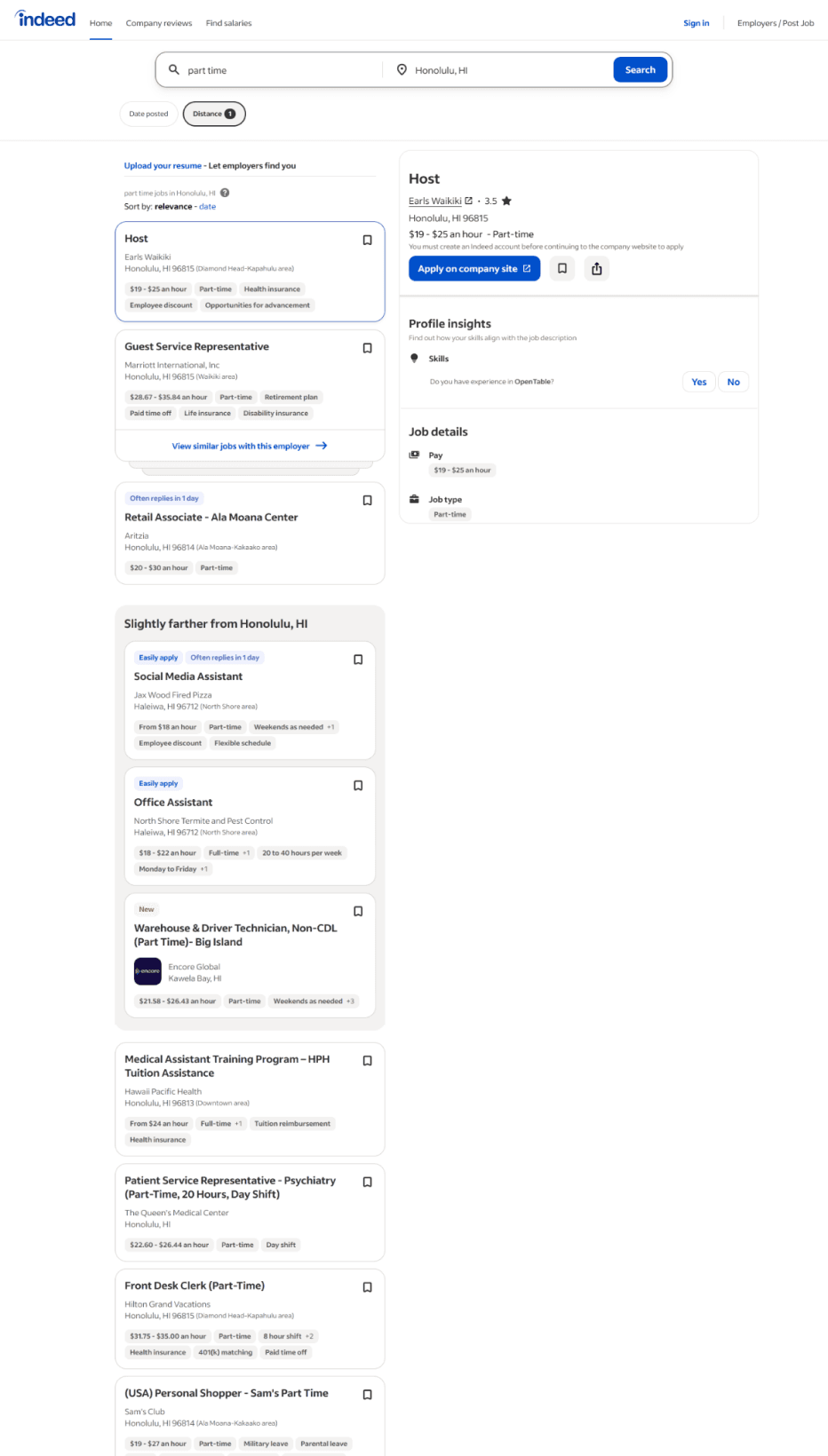
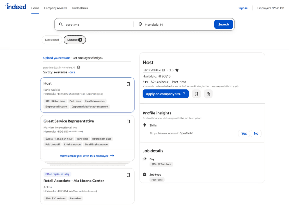
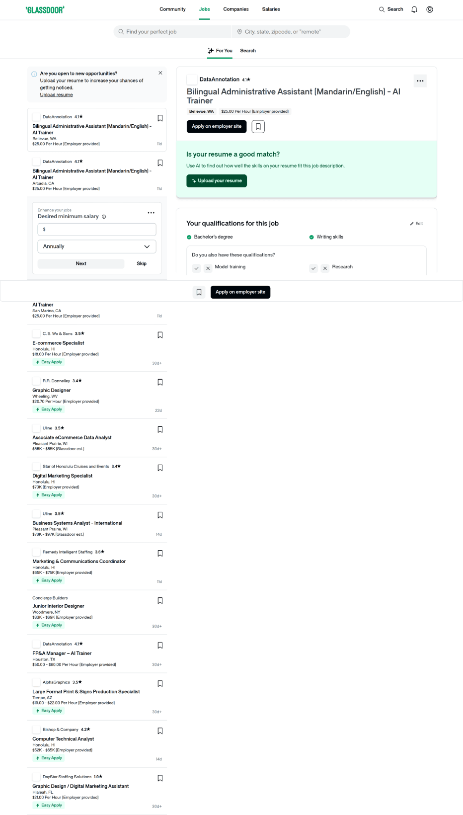
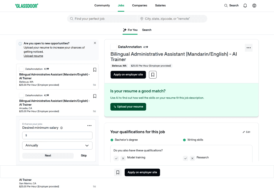
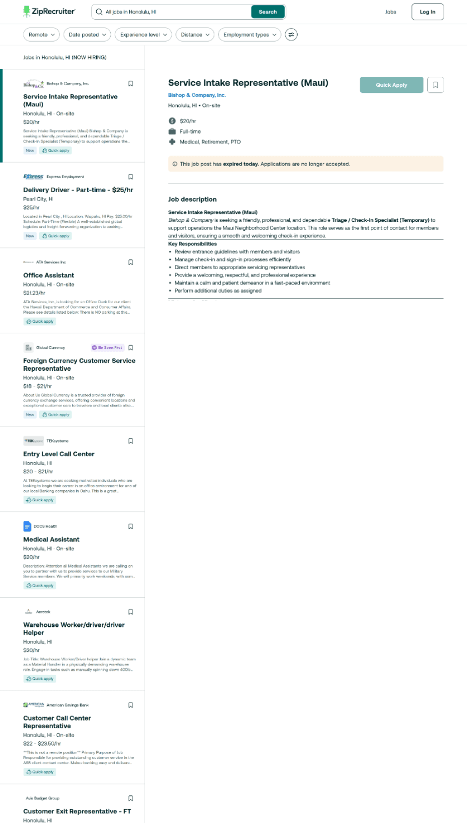
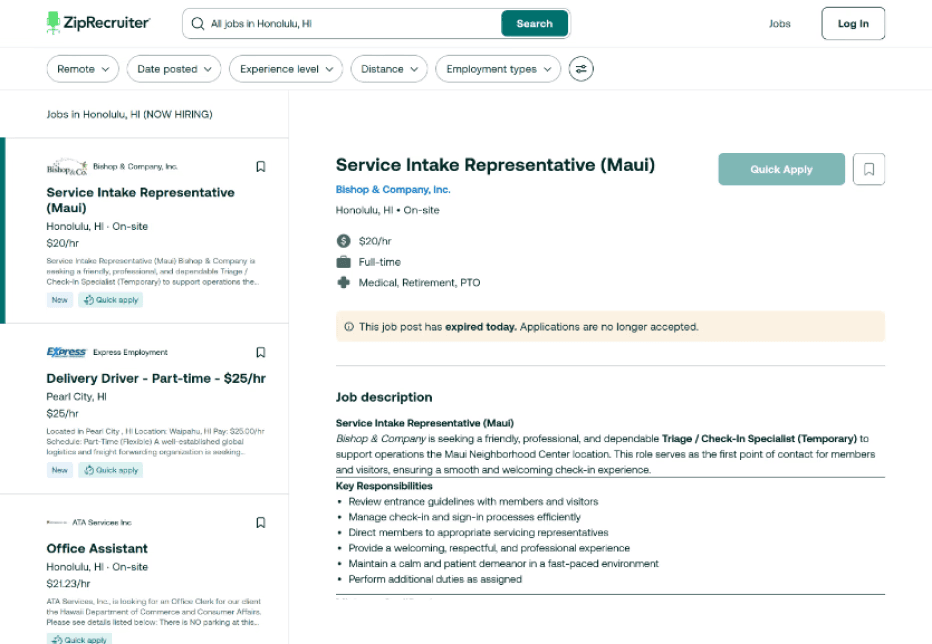
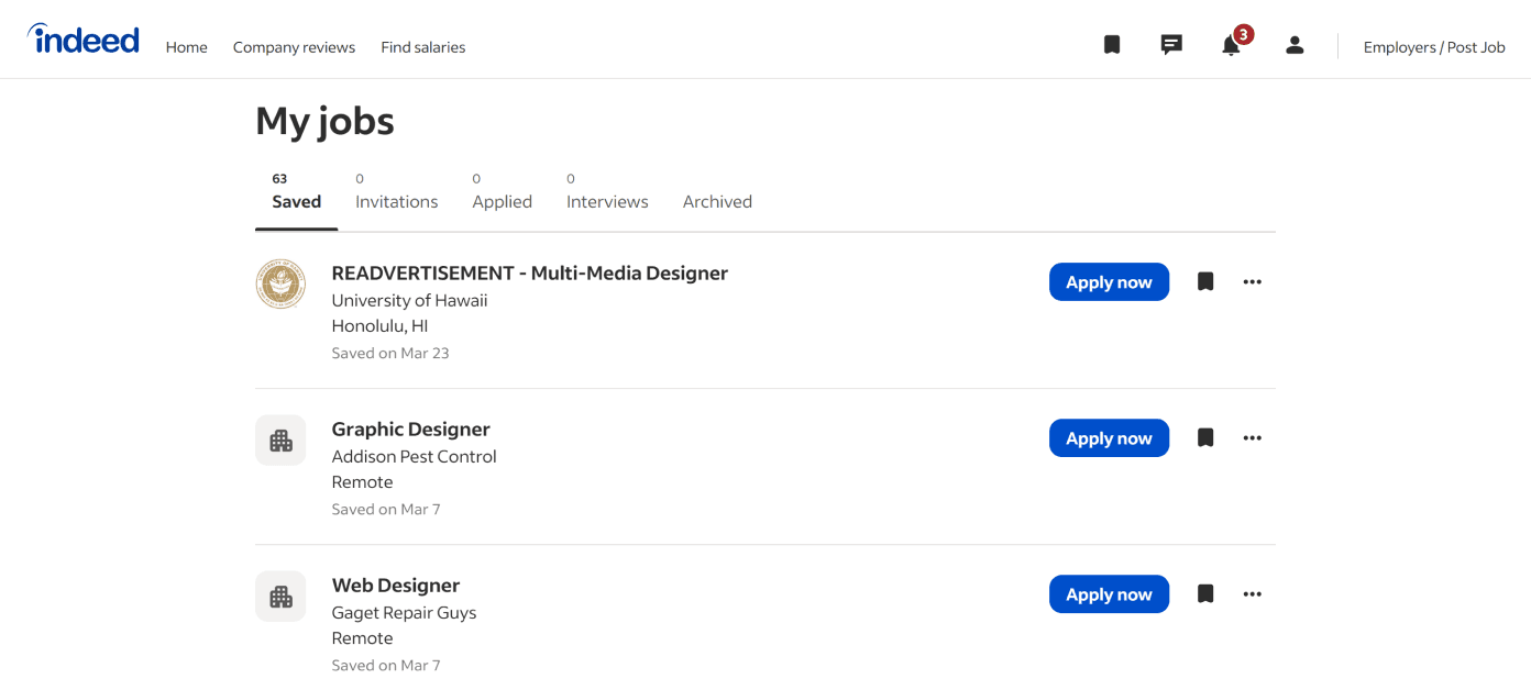
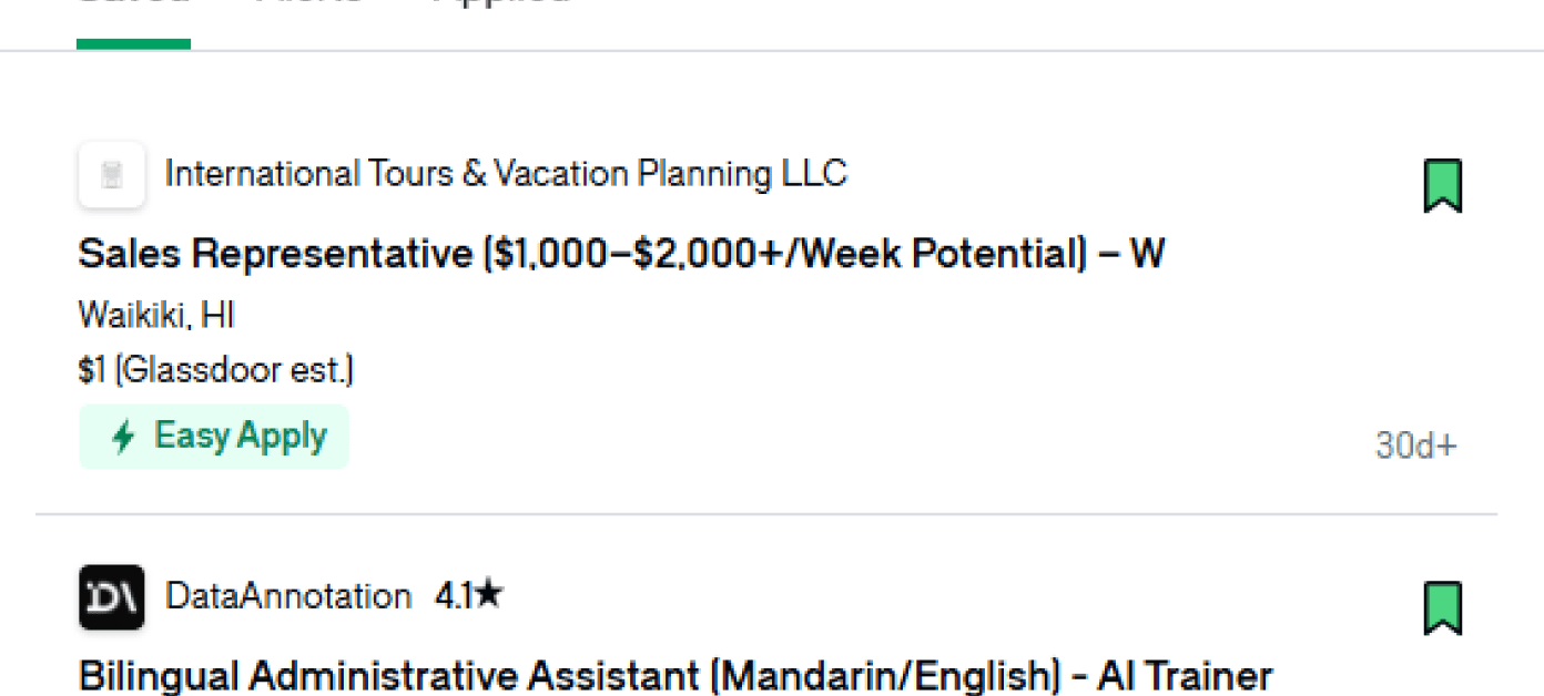

Pill shaped filters are common as they’re easy to scan and adjust.
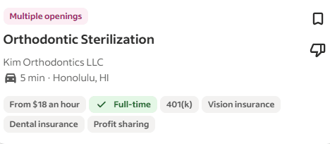
Cards are mainly designed the same with crucial information (Position, Pay, Location) listed and tags.
Cards make jobs scannable
Search & Location are grouped
View jobs even without logging in
Bookmark icon for saving jobs
Split modal let’s you compare jobs
Tabs
Closed jobs are color coded
Days since posting are displayed
Easily remove jobs
PROCESS
Going straight to high fidelity, then iterating fast.
Given the internship timeline, I moved directly into high-fidelity design and used rapid iteration to explore solutions quickly.
FIRST ITERATION LEARNINGS
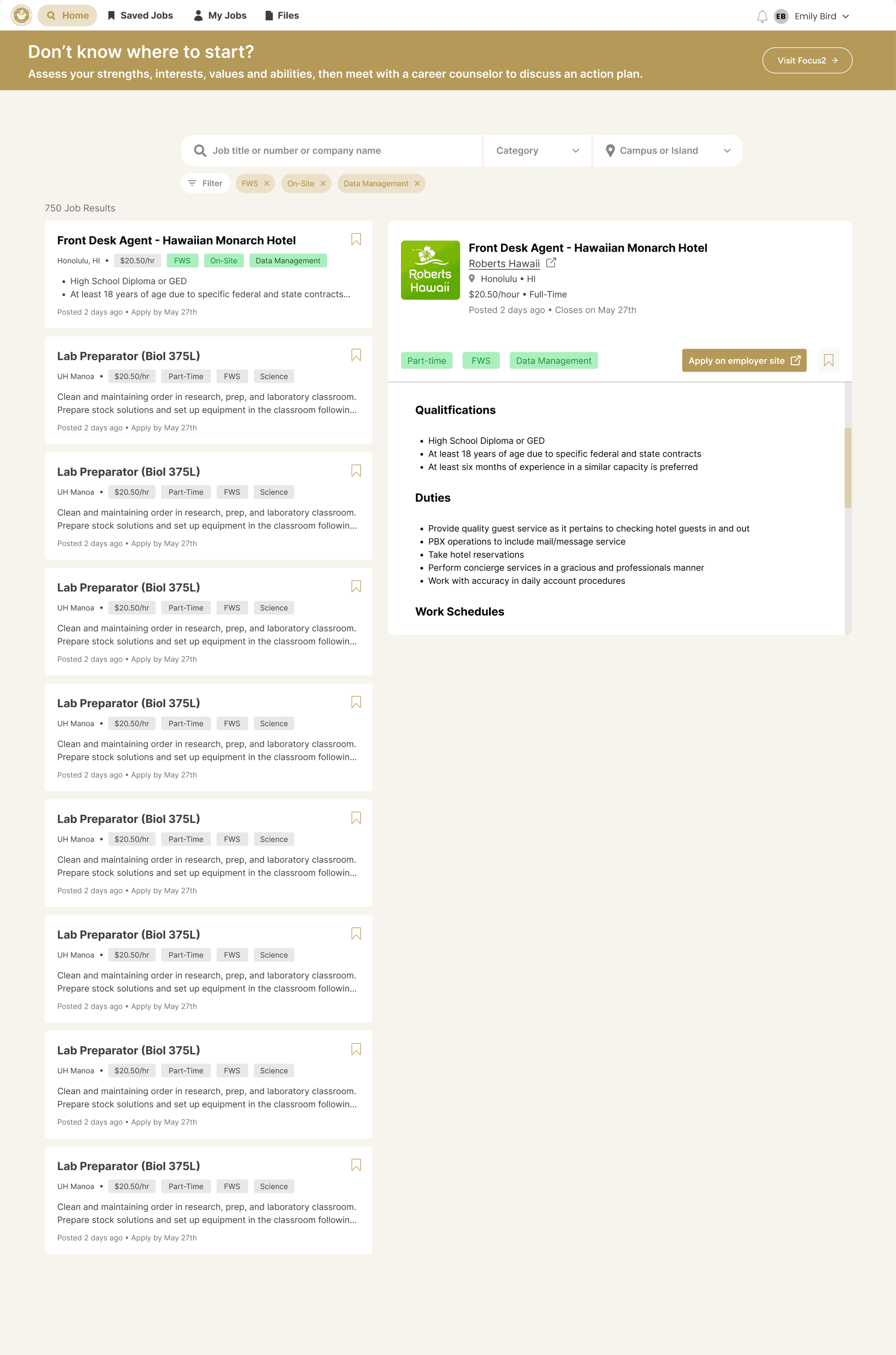
The structure worked. The system did not.



USABILITY TEST
Did the Redesign Solve the Problem?

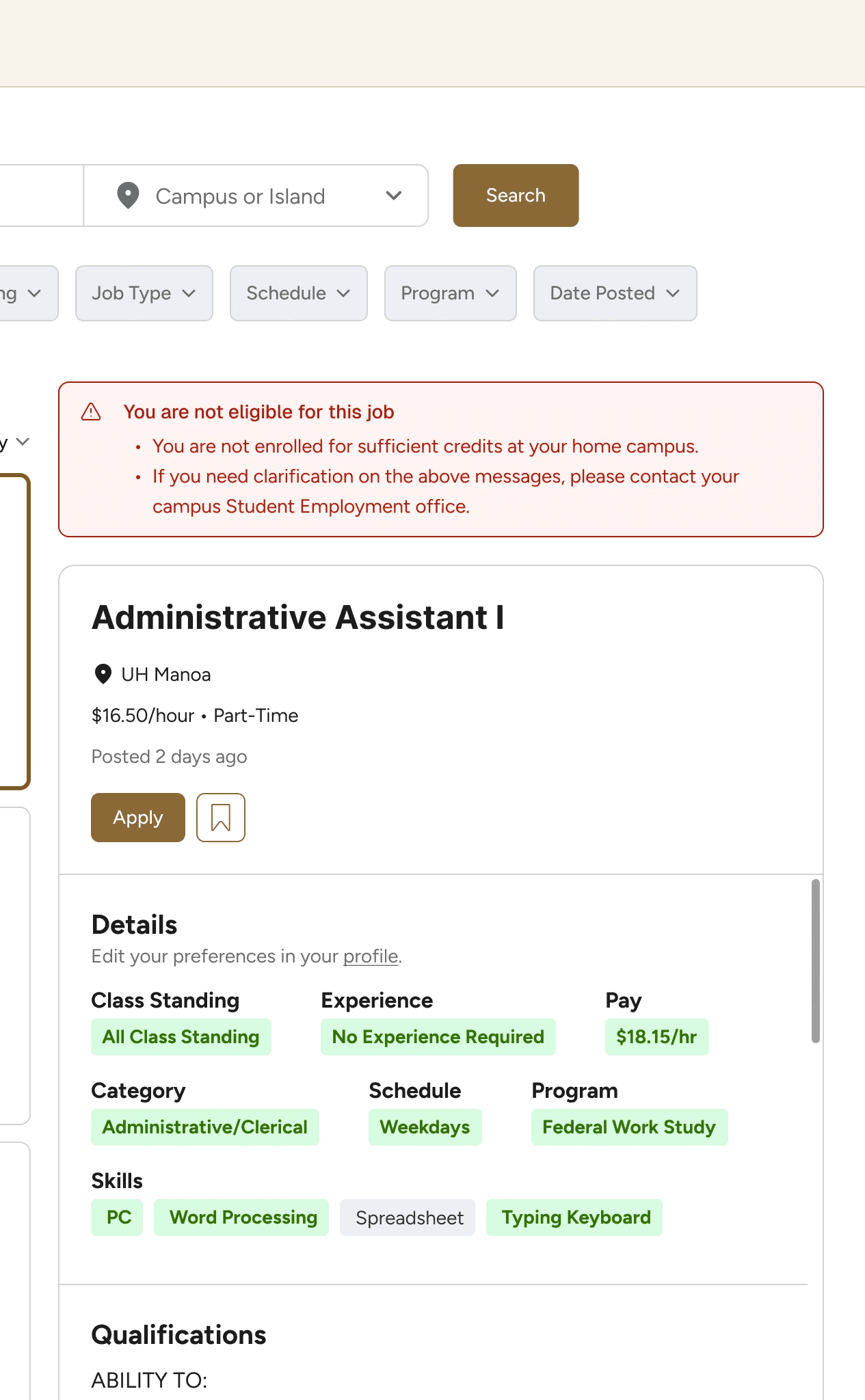
All 7 participants felt jobs were more targeted or useful, had enough information to decide whether to apply, and found eligibility information clear.
FINAL REFINEMENTS
Small clarity fixes, not structural changes.
Made Recommended Jobs More Transparent
Students found recommended jobs useful, but some wanted to know how they were chosen.
I added a short explanation beside the Recommended Jobs heading.


Clarified Federal Work-Study & Pay
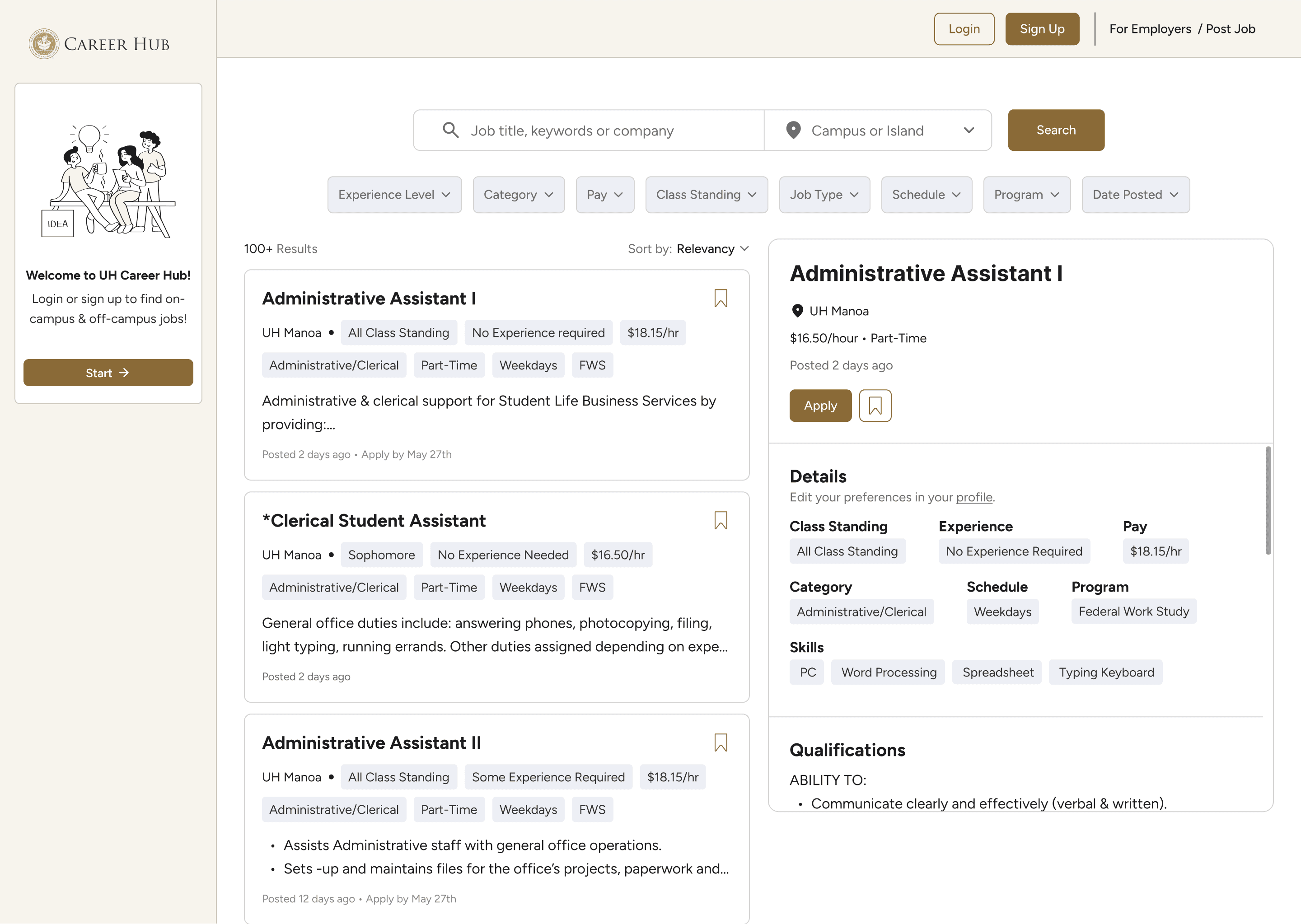
Some students were unsure what “FWS” meant, and the original pay filter only showed hourly ranges. I spelled out Federal Work-Study and added salary options so students searching across on- and off-campus jobs could filter by different compensation types.
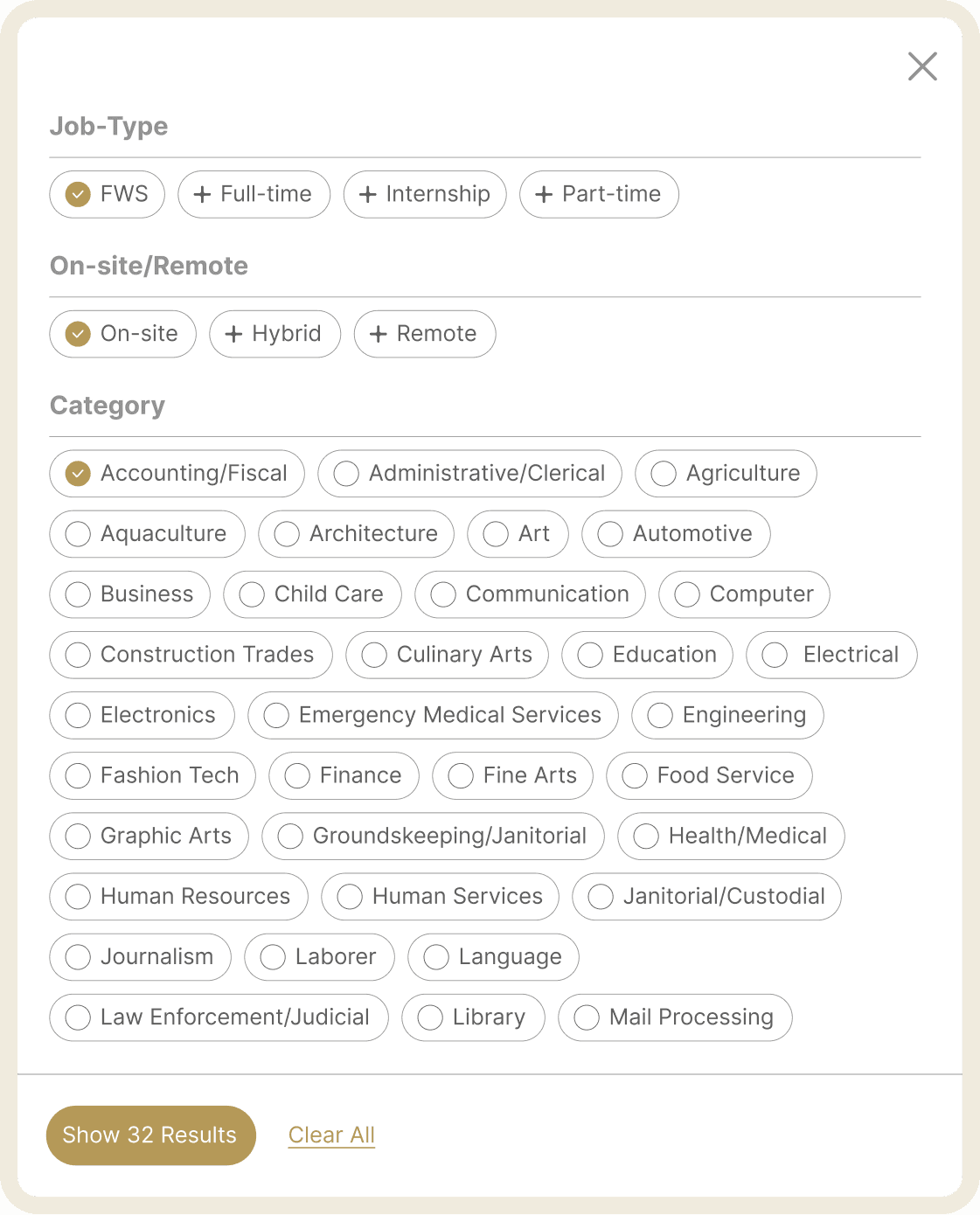
Reordered filters around student decision-making
I moved the most broadly useful criteria first. Experience Level leads, because students of every class standing arrive with different work histories. Category and Pay come next so students can narrow by interest and practical need. More specific eligibility filters like Class Standing come later.

Search Page

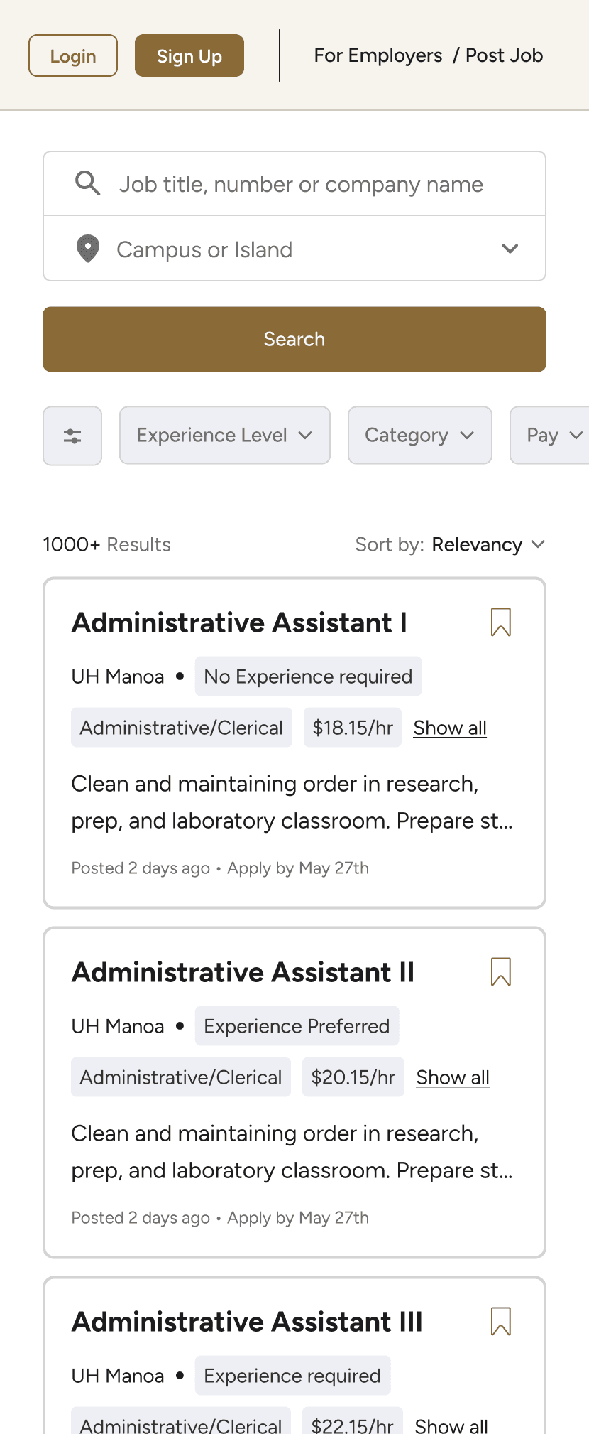
Cards surface pay, program, job type, eligibility, and experience upfront. Filter chips help students narrow results by key criteria before opening a listing.
Saved Jobs
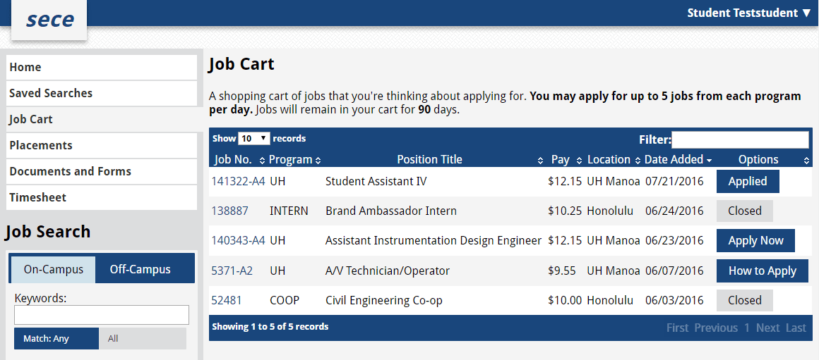
Saved jobs had limited organization and could not be manually removed.

Saved and Applied tabs clarify job status, while unsave and undo actions give students more control.
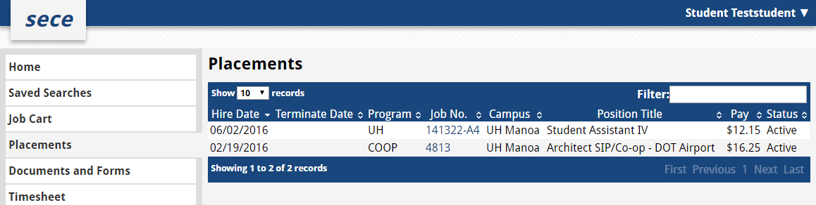
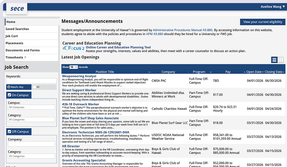
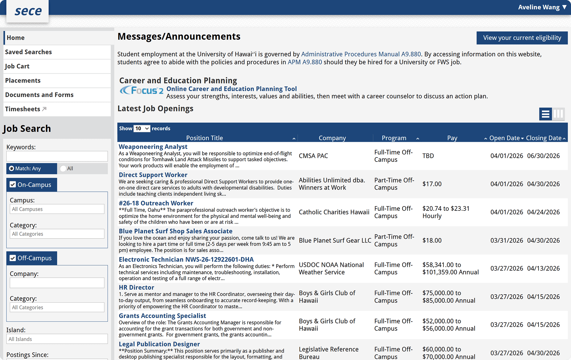
Placements lacked visual hierarchy, making active and closed placements hard to distinguish.

A clean table with tabs separates placements by status.
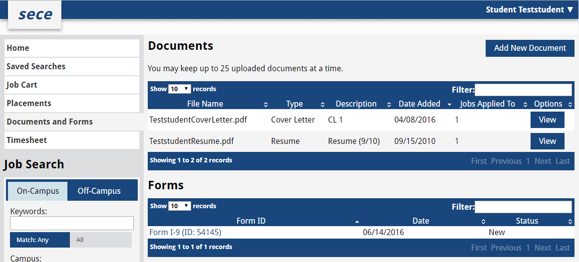
Documents and forms were mixed together in dense, unstyled tables with no status indicators.

Documents and official files are separated into sections, with tabs and status tags to improve clarity.
The student-facing redesign is currently in development as part of the broader Career Hub redesign. I handed off the final screens, reusable component library, and design annotations to support implementation. Although the launch date has not been confirmed, the redesign received positive feedback.
If I had more time & what I would do differently:
Align with the developer earlier: Knowing which UI framework the developer was most comfortable with from the start would have saved significant time.
Start with a UI library: Building from an established component library from day one — with proper documentation and ideally published in Storybook — would have produced a more consistent result and a smoother handoff.
Documenting everything from the start would’ve made writing this case study easier
Explore major as a filter: I would explore using major as a filter or recommendation signal to help students discover relevant roles.
Validate with a more diverse student group
I would test the redesign with a broader range of students to ensure it works across different needs.